Market Competitiveness Comparison Graph – Highlighting Competitive Advantage
RM0400008_28
- Last Update 02/16/2025
- File Size 1MB
- # of Slides 2
- File Format PPTX
- Slide Ratio 16:9
- Color
Keywords
About the Product
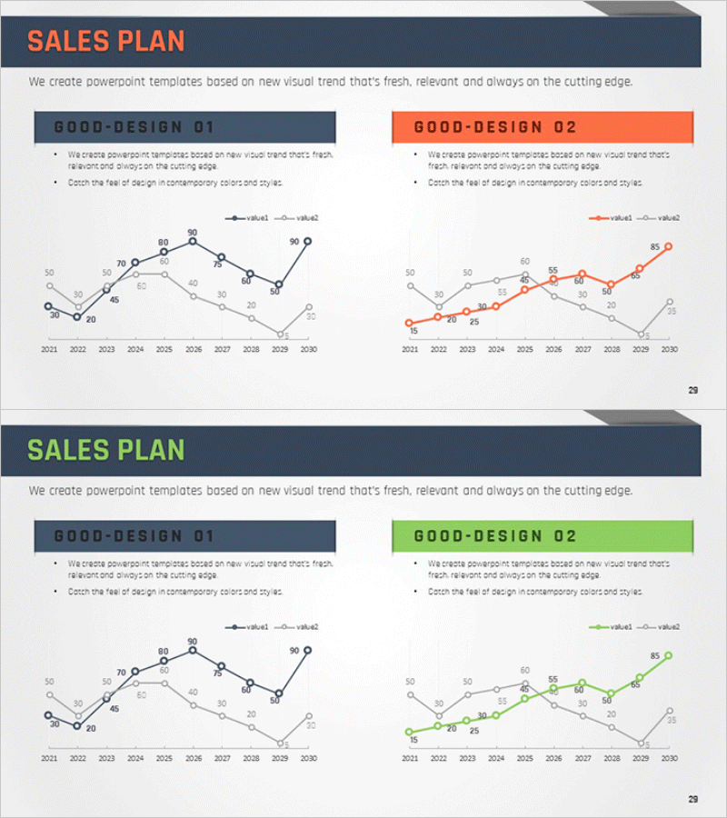
A dual-series line chart PowerPoint slide designed for competitive market analysis and performance benchmarking. This presentation template visualizes two data series across a 10-year timeline from 2021 to 2030, enabling clear comparison of competitive positioning and performance gaps. Data points are labeled with exact values for precise communication. Three color versions—navy blue, orange, and green—are provided to match your presentation style. Immediately editable and ready for business reports, strategy documents, and investor presentations.
Usage Points
-
Main Usage
Visualize competitive market analysis and performance benchmarking using dual-series line data. The 10-year timeline clearly shows competitive advantages, performance gaps, and trend trajectories. Ideal for strategic planning, investment decision-making, and quarterly performance reporting.
-
How to Use
Open the slide and replace existing data values with your own figures. Double-click each data point number to edit values. Update the legend labels (value1, value2) to match your metrics. Select the color version that aligns with your presentation theme and corporate branding.
-
Recommended For
Executive teams, strategy departments, marketing teams, and sales teams presenting competitive analysis results. Suitable for business plans, strategic planning documents, quarterly performance reports, and investor pitch decks. Use for market share comparison, customer satisfaction benchmarking, product performance analysis, and competitive positioning metrics.
-
Slide Structure
Each slide contains a title area, two descriptive text lines, and one line chart. The chart includes X-axis (2021–2030), Y-axis (0–90 scale), two data series lines, and labeled data points. Three color versions (navy blue, orange, green) are provided for flexible design integration.
Related Products
-

Business Competitor Analysis Graph
#Market and Competitor Analysis #Graph #Competitor Analysis
-

Competition Graphs and Analysis – Slides for Market Advantage
#Market and Competitor Analysis #Graph #Competitor Analysis
-

Default Line Graph for Market & Competitor Analysis – Competitive Advantage
#Market and Competitor Analysis #Graph #Competitor Analysis
-

Modern Theme Competitor Analysis Graph
#Market and Competitor Analysis #Graph #Competitor Analysis
