Sleek Graphs and Charts – Visual Data Communication
RJ0300079_11
- Last Update 09/11/2025
- File Size 1.2MB
- # of Slides 2
- File Format PPTX
- Slide Ratio 16:9
- Color
Keywords
About the Product
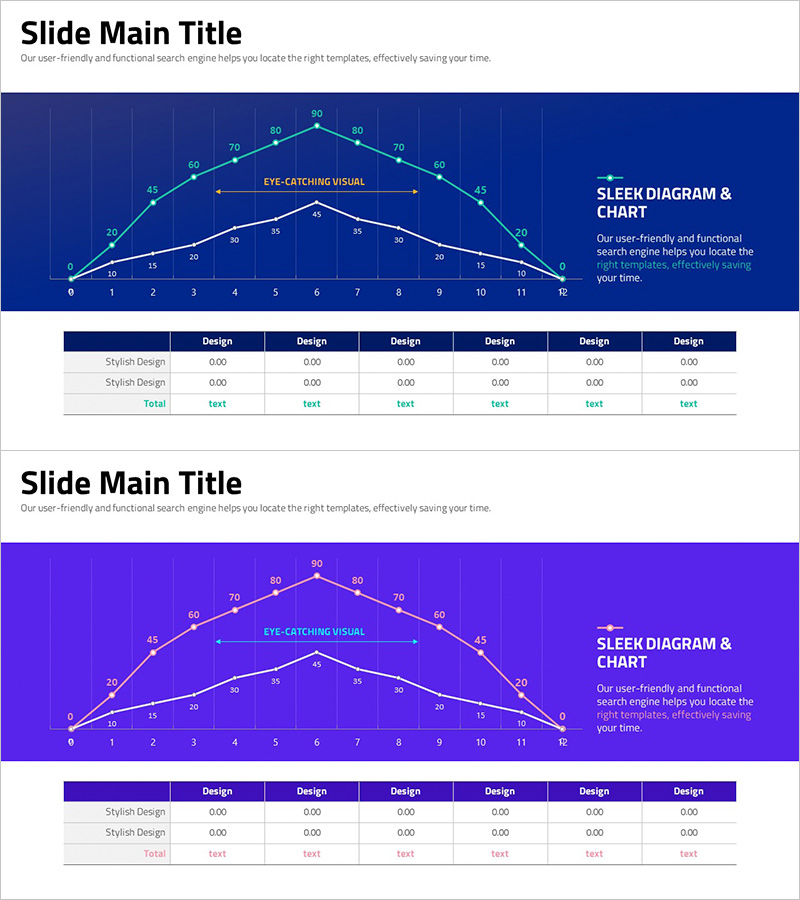
A dual-series line chart PowerPoint slide that visualizes the trend changes of two data sets simultaneously. Set against a dark blue background with white and orange lines, this slide clearly displays numerical changes over time. The grid background and data point markers enable precise value reading, while the right-side text area allows for graph interpretation and key message delivery. This presentation template is ready to use for business reports, performance analysis, and market trend presentations.
Usage Points
-
Main Usage
Optimized for comparing and analyzing trend changes of two or more data series over time. Effectively communicates sales figures, customer counts, market share, or performance versus targets, with grid background and numerical labels supporting accurate data interpretation.
-
How to Use
Use in business report performance analysis sections, quarterly or monthly results presentations, and market trend analysis slideshows. Input key insights or conclusions in the right-side text area to present graph and interpretation together. Modify data points directly to reflect actual figures.
-
Recommended For
Finance professionals, marketing analysts, executive report managers, consultants, and academic presenters use this when conveying quantitative data-driven decisions persuasively. Ideal for quarterly earnings presentations, investor briefings, and internal performance-sharing meetings.
-
Slide Structure
Two line series (white and orange) intersect across a dark blue background following X-axis (0–12 range) and Y-axis (0–90 range). Numerical labels appear at each data point. Top section features 'Eye-Catching Visual' emphasis text, right side displays 'Sleek Diagram & Chart' title with description text box. Bottom includes a 6-column data input table.
Related Products
-

Big Data Analysis Line Graph – Visualizing Competitive Advantage
#Market and Competitor Analysis #Graph #Competitor Analysis
-

Competitor Idea Analysis Graph
#Market and Competitor Analysis #Graph #Competitor Analysis
-

Market Insights Through Competition Analysis Chart – Gaining Competitive Edge
#Market and Competitor Analysis #Graph #Competitor Analysis
-

Fantastic Wide PowerPoint Line Chart – Ideal for Market Analysis
#Market and Competitor Analysis #Graph #Competitor Analysis
