Composition Donut Circle Graph – Product and Service Introduction
RJ0300075_7
- Last Update 05/09/2025
- File Size 0.8MB
- # of Slides 2
- File Format PPTX
- Slide Ratio 16:9
- Color
Keywords
About the Product
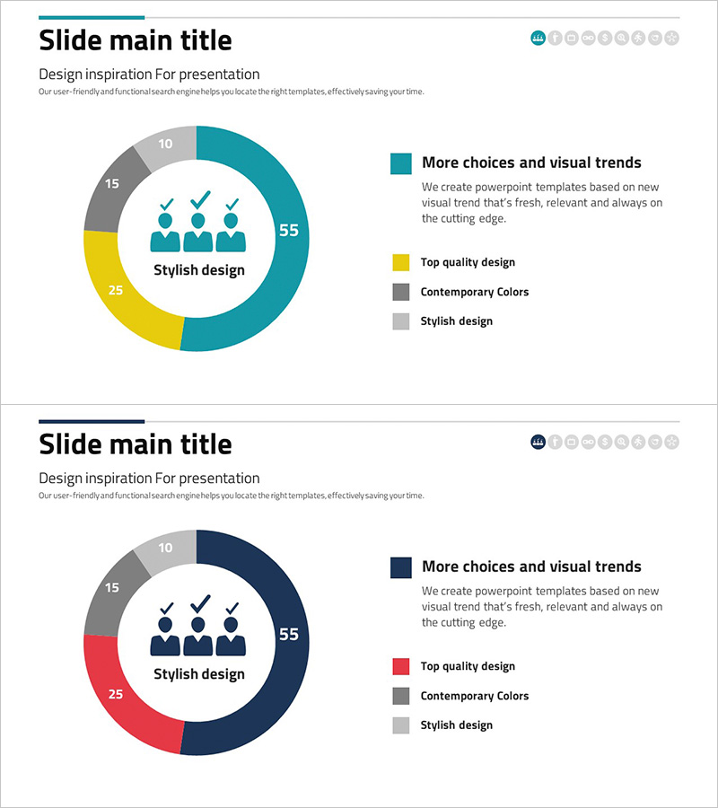
A donut chart PowerPoint slide that visually represents the composition ratio of products and services. Four items are distinguished by different colors (teal, yellow, gray) to clearly convey the proportion of each component. The circular center area allows you to insert key messages, making it suitable for product introductions, service composition, and development status presentations. Composed of 2 slides in 16:9 widescreen format optimized for modern presentation environments. Each color segment is designed for data input, enabling immediate editing and use. The donut chart format provides a professional appearance while maintaining clarity in data visualization.
Usage Points
-
Main Usage
Visualize the proportion of product or service components at a glance using a donut chart format. Express the ratio relationship of four items clearly to enhance audience comprehension, and maximize brand emphasis by placing core messages or logos in the center area.
-
How to Use
Use when explaining the proportion of key features in product presentations, expressing the importance of each service area in service composition explanations, and comparing completion rates, progress, and planned items in development status reports. Customize each segment's data to fit various datasets.
-
Recommended For
Product marketing managers, service planners, business development teams, executive report coordinators, consultants, and educators who need to explain composition ratios in presentations. Particularly effective for B2B proposals, business plans, and quarterly performance reports.
-
Slide Structure
Composed of 2 slides, each featuring a 4-segment donut chart as the central element. The first slide displays the chart in teal, yellow, gray, and light gray colors. The second slide presents a variant version with teal, red, gray, and light gray colors. The center circular area provides space for text insertion to add titles or key figures.
Related Products
-

Data Status Analysis Pie Chart – Intuitive Visualization
#Product/Service Introduction #Graph #Other
-

Analysis of Smart Network Systems – Data Visualization for Innovation
#Product/Service Introduction #Diagram #Graph
-

Shopping Status Analysis Graph – Effective Data Presentation
#Product/Service Introduction #Graph #Composition
-

Data Analysis Status Pie Chart – A Tool for Clear Understanding
#Product/Service Introduction #Graph #Other
