Area Graph for Business Area Analysis
RJ0300075_27
- Last Update 05/09/2025
- File Size 0.8MB
- # of Slides 2
- File Format PPTX
- Slide Ratio 16:9
- Color
Keywords
About the Product
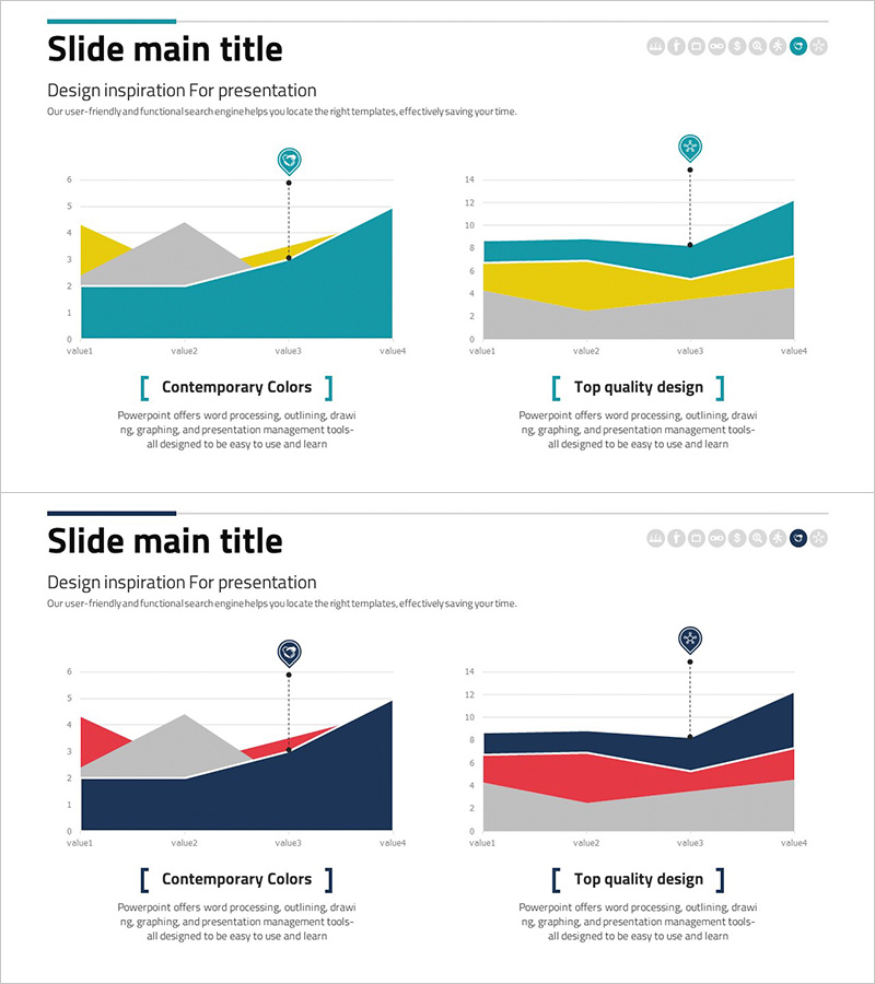
An area graph PowerPoint slide designed for business field analysis and competitive comparison. The slide features two independent area charts with teal, yellow, and gray layered colors visualizing four data points simultaneously. The left chart displays an upward trend while the right chart shows fluctuating data, making it ideal for presenting market conditions, revenue trends, and market share changes. Each slide includes title and subtitle areas plus two dedicated graph spaces for multi-layer data comparison. Available in 16:9 widescreen PPTX format, fully editable and ready for corporate presentations, investor relations materials, and strategic reports.
Usage Points
-
Main Usage
Visualize multi-layer business data such as revenue by field, market share, and market size using area graphs to clearly show competitive advantages and market trends. The dual-chart layout enables simultaneous comparison of upward trends and volatile data patterns.
-
How to Use
Enter your analysis topic in the title and subtitle areas (e.g., market share trends, competitor revenue comparison), then update chart legends and axis labels to match your data. The teal, yellow, and gray colors can be customized to your corporate brand palette, and data updates automatically reflect in the graphs.
-
Recommended For
Ideal for market analysis presentations by strategy, marketing, and sales teams; executive reports; investor relations materials; business plan market overview sections; and competitive analysis documents. Particularly effective for decision-making materials requiring multi-layer data comparison.
-
Slide Structure
Each slide consists of a title and subtitle area at the top (2 text input fields) and two independent area graph spaces below. Each graph contains 4 data points (value1–value4) with 3 color layers (teal, yellow, gray), including legend and axis label areas for customization.
Related Products
-

Bank Securities Service Area Graph – Market Analysis and Competitive Advantage
#Market and Competitor Analysis #Graph #Other
-

Goal Achievement Analysis Area Graph – Data-driven Competitive Edge
#Market and Competitor Analysis #Graph #Other
-

Mobile App Competitor Analysis – Visualizing Market Share
#Market and Competitor Analysis #Graph #Other
-

Business Analysis Chart – Visualizing Competitive Advantage
#Market and Competitor Analysis #Graph #Other
