Third Party Comparison Analysis Line Graph – Highlighting Market Competitiveness
RJ0300073_28
- Last Update 05/09/2025
- File Size 1.5MB
- # of Slides 2
- File Format PPTX
- Slide Ratio 16:9
- Color
Keywords
About the Product
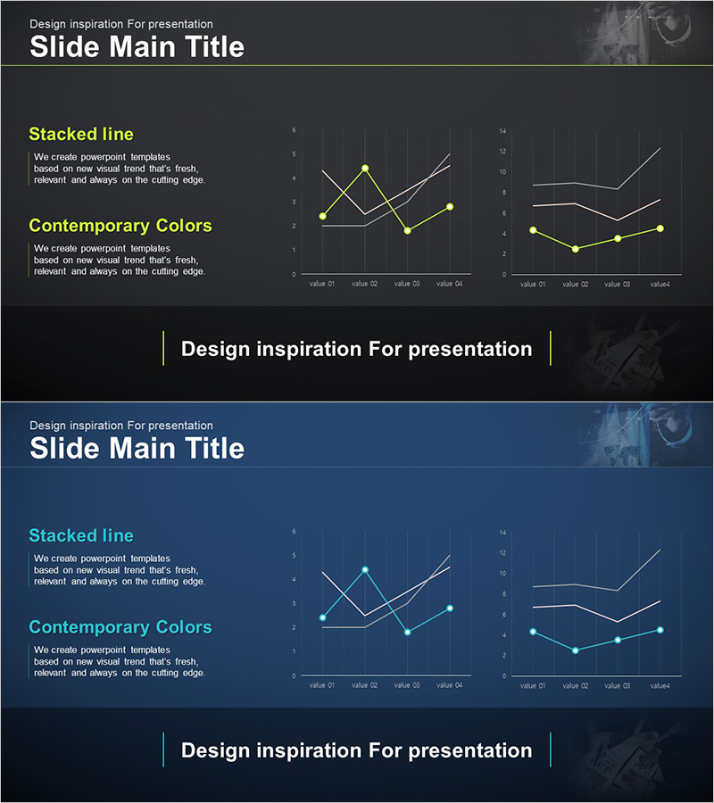
A 2-slide line graph PowerPoint template designed for competitive analysis and market comparison. Features a dark gray background with lime green data points and white trend lines, displaying two independent line charts side-by-side to track four data points each. The left section includes titled areas for 'Stacked Line' and 'Contemporary Colors' with descriptive text blocks, enabling simultaneous visualization of market trends, competitor performance, and company metrics. Delivered in 16:9 widescreen PPTX format, fully editable and ready for investor presentations, executive reports, and market analysis decks.
Usage Points
-
Main Usage
Visualizes competitor performance, market trends, and company metrics simultaneously to emphasize competitive advantage. The dual line graphs clearly show change trajectories over time, delivering a compelling narrative to investors, partners, and executives about your market position.
-
How to Use
Deploy in investor relations materials, executive briefings, and market analysis presentations to compare competitor metrics against your company's growth rate, market share, or customer satisfaction. Replace chart data with actual figures and customize text blocks for immediate use in board meetings or pitch decks.
-
Recommended For
Strategy, marketing, and sales teams preparing investor pitches, quarterly executive reports, and competitive positioning documents. Ideal for IR presentations, business proposals, and strategic planning sessions where demonstrating competitive advantage is critical.
-
Slide Structure
Dark gray background with title area at top, left section containing two text input blocks (title + description), and right section with two line chart areas. Each chart tracks four data points (value Q1–Q4) highlighted with lime green points and white connecting lines.
Related Products
-

Eco-friendly Icon Bar Graph Slide
#Market and Competitor Analysis #Diagram #Graph
-

Competitor Comparison Line Graph
#Market and Competitor Analysis #Graph #Competitor Analysis
-

Current Status of Space Business Visualized with Donut Chart - Competitive Edge Analysis
#Market and Competitor Analysis #Graph #Competitor Analysis
-

Service Analysis Line Graph – Visualization of Competitive Advantage
#Market and Competitor Analysis #Diagram #Graph
