Year-by-Year Comparative Analysis Line Graph – Market Trend Insights
RJ0300073_14
- Last Update 05/09/2025
- File Size 1.3MB
- # of Slides 2
- File Format PPTX
- Slide Ratio 16:9
- Color
Keywords
- #Content-Based Slides
- #Design-Based Slides
- #Market and Competitor Analysis
- #Graph
- #Market Status
- #Industry Trends
- #Line
- #Line Chart
- #16:9
- #line graph PowerPoint slide
- #year-over-year comparison template
- #market trend analysis presentation
- #dual-series chart template
- #PowerPoint trend visualization
- #how to create line graph in PowerPoint
About the Product
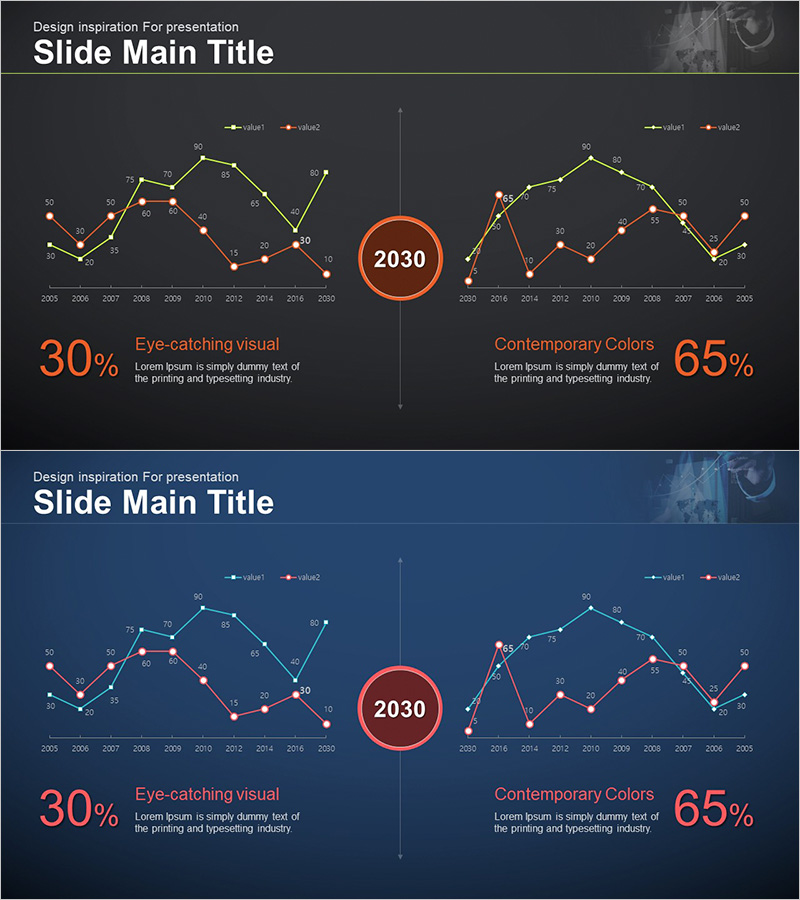
A professional line graph PowerPoint slide set for comparing market trends and performance metrics across years. The dual-series design uses orange and blue color schemes to distinguish two data sets, with a central circular badge highlighting the reference year (2030). The dark background with bright accent colors creates strong visual contrast suitable for large conference room presentations. Each slide displays data spanning 2005–2030 with clear data point labels and trend lines. Ideal for business reports, investor presentations, competitive analysis, and quarterly performance reviews.
Usage Points
-
Main Usage
Visualize and compare two or more data series over time (years, months, quarters) to reveal trends, patterns, and performance changes. Effectively communicates market dynamics, sales performance, competitive benchmarking, and financial forecasts. The central circular badge allows emphasis on a specific reference point or milestone.
-
How to Use
Deploy in executive briefings, investor relations presentations, quarterly earnings reports, marketing strategy sessions, and competitive analysis meetings. The high-contrast dark background ensures excellent readability in large meeting rooms and auditoriums. Easily customize by replacing data values and labels to match your specific metrics and timeframes.
-
Recommended For
Finance and accounting professionals, marketing strategists, business development managers, management consultants, data analysts, and executives presenting performance metrics. Particularly suited for quarterly reviews, annual reports, market analysis, and competitive positioning discussions.
-
Slide Structure
2-slide set with dual-series line graphs arranged symmetrically. X-axis displays years (2005–2030), Y-axis shows numerical scale with gridlines. Each data point is labeled with values. Central circular badge (2030) emphasizes the reference year. Bottom section features key metrics (30%, 65%) with descriptive text. Color-coded legend distinguishes the two data series.
Related Products
-

Market Trend Analysis Graph – Sleek and Stylish Design
#Market and Competitor Analysis #Diagram #Graph
-

System Efficiency Growth – Market Analysis and Business Strategy
#Business Strategy #Market and Competitor Analysis #Graph
-

Comparison of Change Curves – Market and Competitor Analysis
#Market and Competitor Analysis #Graph #Market Status
-

Origami Line Chart Slide - Visualizing Business Performance
#Business Strategy #Market and Competitor Analysis #Graph
