Effective Use of Space Development Donut Circle Graph
RJ0300071_10
- Last Update 05/08/2025
- File Size 0.3MB
- # of Slides 2
- File Format PPTX
- Slide Ratio 16:9
- Color
Keywords
- #Content-Based Slides
- #Design-Based Slides
- #Product/Service Introduction
- #Business Introduction
- #Diagram
- #Graph
- #Development Status
- #Technological Status
- #Cluster
- #Circles
- #Closed Cluster Diagram
- #Doughnut Chart
- #16:9
- #donut chart PowerPoint
- #pie chart slide template
- #4-segment data visualization
- #donut graph presentation
- #ratio chart PPT
About the Product
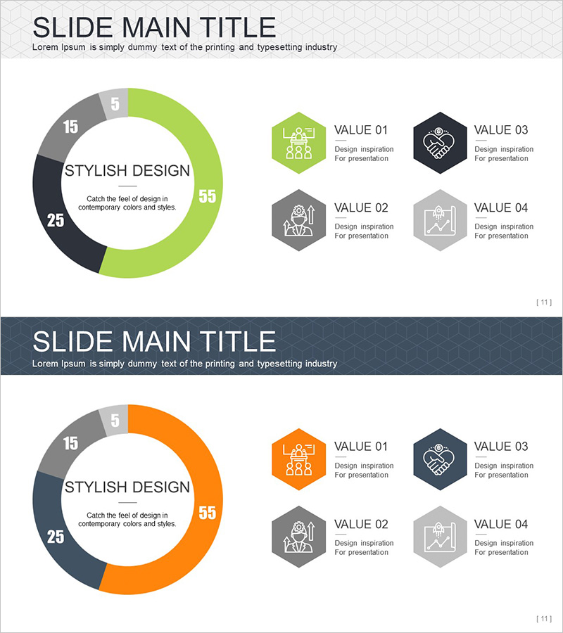
A donut-shaped pie chart PowerPoint slide designed to visualize space development project budgets, technology investment ratios, and organizational structures with clarity and impact. The slide features four segments in lime green, orange, dark navy, and light gray tones, each labeled with numerical values and accompanied by supporting icons. The center area accommodates a key message, while four hexagonal icon boxes (VALUE 01–04) on the right enable detailed descriptions for each segment. Comprising two slides with customizable color schemes, this template adapts seamlessly to various presentation contexts including technology reports, business proposals, and data analysis briefings.
Usage Points
-
Main Usage
Effectively compares and emphasizes the proportional relationships among four data categories such as space development investments, technology allocations, budget distributions, or organizational divisions. The central text area highlights the core message, while the right-side icon boxes provide structured detail for each segment.
-
How to Use
Replace segment percentages with your project budget figures, technology fields, or department allocations. Customize the VALUE boxes with relevant text and icons matching your data categories. Adjust colors to align with corporate branding for immediate use in technology presentations, investor briefings, and business reports.
-
Recommended For
Technology managers, project leads, financial analysts, and executives presenting complex data to stakeholders. Ideal for aerospace, IT, manufacturing, and energy sectors requiring strategic presentations and performance reports with visual clarity.
-
Slide Structure
Slide 1: Four-segment donut chart (lime green 55% + dark navy 25% + gray 15% + light gray 5%) with center text area and four hexagonal icon boxes (VALUE 01–04) on the right. Slide 2: Identical structure with orange replacing lime green, providing color variation for diverse presentation needs.
Related Products
-

Business Development Status Donut Graph – A Template for Visual Communication
#Product/Service Introduction #Business Introduction #Diagram
-

Exercise Objectives Achieved Diagram & Chart – Post-Progress
#Product/Service Introduction #Business Introduction #Diagram
-

Construction Business Analysis Donut Chart
#Product/Service Introduction #Business Introduction #Diagram
-

Business Analysis with Doughnut Chart – Dawn City Theme
#Product/Service Introduction #Business Introduction #Diagram
