Monitoring Analysis Bar Graph – Effective Tool for Market and Competitor Analysis
RJ0300069_10
- Last Update 05/07/2025
- File Size 0.7MB
- # of Slides 2
- File Format PPTX
- Slide Ratio 16:9
- Color
Keywords
- #Content-Based Slides
- #Design-Based Slides
- #Market and Competitor Analysis
- #Graph
- #Market Analysis
- #Horizontal Bar
- #Grouped Horizontal Bar
- #16:9
- #horizontal bar chart PowerPoint
- #grouped bar graph template
- #market analysis slide
- #competitor analysis chart
- #trend comparison graph
- #data visualization PowerPoint slide
About the Product
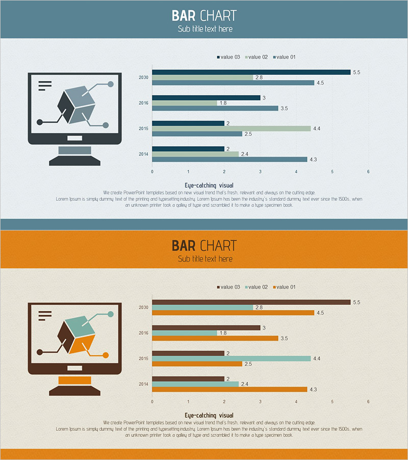
A grouped horizontal bar chart PowerPoint slide designed for market trend and competitor analysis presentations. This slide template visualizes data across five years (2014–2030) with three data series displayed side by side, enabling simultaneous comparison of annual trends and inter-series performance. The bars are color-coded in teal, dark navy, and light green to distinguish each metric clearly. Ideal for market research, competitive benchmarking, and monitoring analysis reports that require multi-series data visualization.
Usage Points
-
Main Usage
Perfect for presentations requiring year-over-year trend analysis and multi-metric comparison, such as market analysis, competitive intelligence, and performance monitoring reports. The side-by-side bar arrangement makes it easy to spot differences between metrics within the same year.
-
How to Use
Each year row contains three bars representing the three data series. Simply input your numerical values and the bar lengths adjust automatically. Color coding distinguishes each series, while the legend clarifies what each metric represents. During presentations, you can emphasize year-on-year changes and performance gaps between competitors or metrics.
-
Recommended For
Marketing teams analyzing market share trends, sales teams conducting competitor benchmarking, executives reviewing performance monitoring, and consultants presenting data-driven analysis. Recommended for any business presentation requiring quantitative multi-series comparison and trend visualization.
-
Slide Structure
Two-slide set with distinct color themes: the first slide features a teal header, the second an orange header. Each slide contains four year rows (2020, 2016, 2015, 2014) with three grouped bars per year (value 03, value 02, value 01), and a horizontal axis ranging from 0 to 6 for numerical reference.
Related Products
-

Management Performance Analysis Bundle Chart
#Business Strategy #Market and Competitor Analysis #Graph
-

Cybersecurity Business Market Analysis Graph
#Market and Competitor Analysis #Graph #Competitor Analysis
-

White Black Bundle Horizontal Bar Graph
#Market and Competitor Analysis #Graph #Market Analysis
-

Travel Guide Market Analysis by State in the United States Using Horizontal Bar Chart
#Market and Competitor Analysis #Graph #Other
