Management Performance Analysis Bundle Chart
RM0500009_15
- Last Update 02/22/2025
- File Size 0.5MB
- # of Slides 2
- File Format PPTX
- Slide Ratio 16:9
- Color
Keywords
- #Content-Based Slides
- #Design-Based Slides
- #Business Strategy
- #Market and Competitor Analysis
- #Graph
- #Achievements
- #Market Analysis
- #Horizontal Bar
- #Grouped Horizontal Bar
- #16:9
- #grouped bar chart PowerPoint
- #bar chart slide template
- #management performance analysis
- #data comparison chart
- #business report PowerPoint slide
About the Product
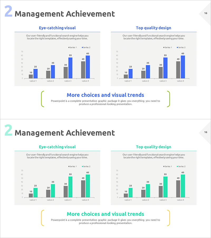
A grouped bar chart PowerPoint slide designed for management performance analysis and data comparison. This presentation template displays two data series across four items side-by-side, enabling clear visualization of performance trends and comparative metrics. The design uses a gray and blue two-tone color scheme to distinguish data series, with numerical labels displayed above each bar for precise value identification. Ideal for business reports, executive presentations, sales performance reviews, and market analysis documents where comparative data visualization is essential.
Usage Points
-
Main Usage
Effectively compare two data series across multiple categories and visualize performance trends in management metrics, sales figures, and market analysis results. The side-by-side bar arrangement allows audiences to instantly recognize differences between series and track performance changes across items.
-
How to Use
Apply this slide in business reports, executive briefings, quarterly performance presentations, and marketing analysis materials. The color-coded bars and numerical labels enable accurate data communication, while the light background ensures readability in projection environments. Easily customize data values and category labels to match your specific analysis.
-
Recommended For
Executives, finance teams, marketing professionals, business planners, and consultants who need to present quantitative performance data persuasively. Particularly useful for quarterly performance comparisons, departmental achievement analysis, competitive benchmarking reports, and KPI tracking presentations.
-
Slide Structure
Two-slide layout featuring identical grouped bar chart structures on left and right sides. Each chart displays four items (value 1–4) on the X-axis with two data series (Series 1 and 2) distinguished by color. Numerical labels appear above each bar, with dedicated title and description text areas for context and interpretation.
Related Products
-

Performance Analysis Graph by Field – Visualizing Business Performance
#Business Strategy #Market and Competitor Analysis #Graph
-

Analysis by Figures with Horizontal Bar Chart – Data-Driven Market Strategy
#Business Strategy #Market and Competitor Analysis #Graph
-

Medical Record Analysis Bar Graph – Market and Competitor Analysis
#Market and Competitor Analysis #Graph #Competitor Analysis
-

Market Analysis Graph for Business Success
#Business Strategy #Market and Competitor Analysis #Graph
