PC Mockup & Column Bundle Graph
RJ0300068_16
- Last Update 05/07/2025
- File Size 1.5MB
- # of Slides 2
- File Format PPTX
- Slide Ratio 16:9
- Color
Keywords
- #Content-Based Slides
- #Design-Based Slides
- #Market and Competitor Analysis
- #Graph
- #Other
- #Competitor Analysis
- #Market Analysis
- #Column
- #Grouped Column
- #Mockup
- #16:9
- #PC mockup PowerPoint slide
- #grouped column chart template
- #multi-series data comparison
- #market analysis presentation
- #competitive analysis slide
- #data visualization PowerPoint
About the Product
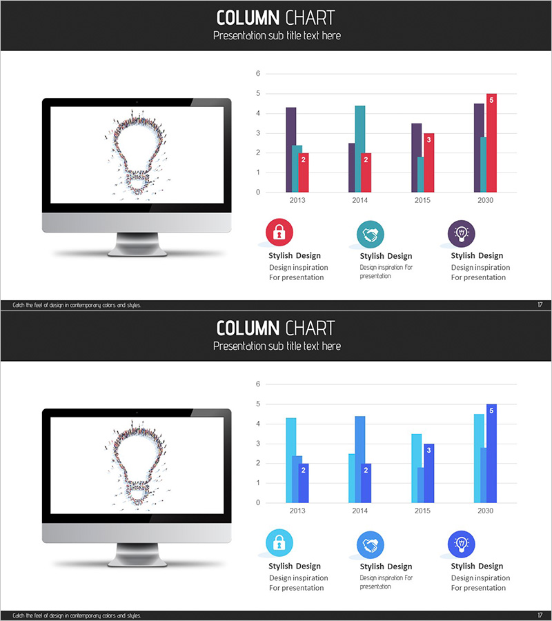
This PowerPoint slide combines a PC monitor mockup with a grouped column chart, displaying data across four series from 2013 to 2030. Ideal for market analysis, competitive benchmarking, and sales performance presentations. The design features a dark header section and a light chart area for clear information hierarchy. Four distinct colors—purple, red, cyan, and gray—differentiate each data series. The slide is fully editable in PPTX format, allowing you to customize data values, axis labels, and legend items to match your presentation context.
Usage Points
-
Main Usage
Visualize multi-series numerical data by combining a digital device mockup with a grouped column chart, enabling side-by-side comparison of four data categories across multiple time periods. Perfect for presenting market trends, competitive performance, departmental results, or quarterly revenue comparisons.
-
How to Use
Slide 1 displays the PC mockup on the left with the chart title and legend on the right. Slide 2 presents the same chart in an alternative color scheme. Edit the bar heights and colors to input your actual data, and update the legend labels to reflect your specific categories. Both slides are fully customizable to fit your presentation narrative.
-
Recommended For
Marketing professionals, sales teams, and executives preparing quarterly or annual performance reports, competitive analysis, and market trend presentations. Also suitable for academic presentations, consulting reports, and investor pitch decks where complex multi-series data needs clear visual communication.
-
Slide Structure
2-slide set. Slide 1: PC monitor mockup (with lightbulb icon) on the left; grouped column chart on the right showing 2013–2030 data with 4 color-coded series (Y-axis 0–6). Slide 2: Same chart data rendered in light blue and dark blue two-color scheme. Design credit text at bottom of each slide.
Related Products
-

Laptop Mockup Bar Graph – Essential Slide for Competitor Analysis
#Market and Competitor Analysis #Graph #Other
-

Competitor Comparison Analysis Bar Graph – Market Insights
#Market and Competitor Analysis #Graph #Competitor Analysis
-

Paper Theme Table Chart & Bar Graph – Market Analysis and Competitive Strength
#Market and Competitor Analysis #Diagram #Graph
-

3D Printing Market Analysis Graph
#Market and Competitor Analysis #Diagram #Graph
