Comparative Analysis Graph – Optimal Tool for Market and Competitor Analysis
RJ0300068_12
- Last Update 05/07/2025
- File Size 1.2MB
- # of Slides 2
- File Format PPTX
- Slide Ratio 16:9
- Color
Keywords
- #Content-Based Slides
- #Design-Based Slides
- #Market and Competitor Analysis
- #Graph
- #Competitor Analysis
- #Market Analysis
- #Horizontal Bar
- #Circles
- #Segmented Horizontal Bar
- #Pie Chart
- #16:9
- #pie chart PowerPoint slide
- #horizontal bar graph template
- #comparative analysis chart
- #market analysis graph
- #competitor analysis slide
- #data visualization PowerPoint
About the Product
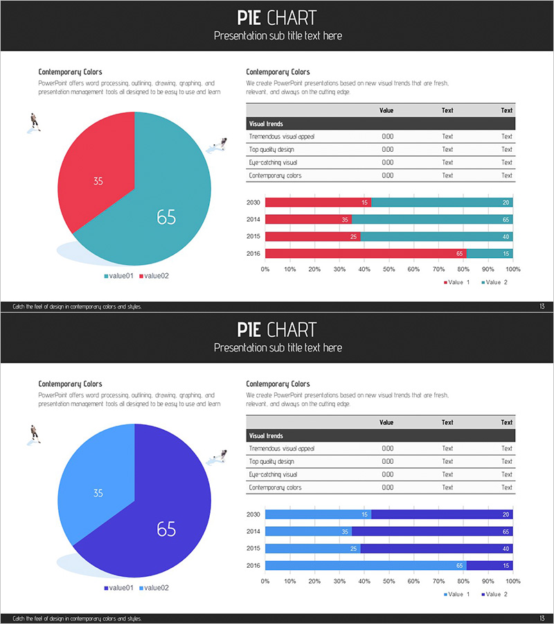
A PowerPoint slide set designed for market analysis and competitor comparison presentations. The 2-slide deck features a pie chart with 65:35 ratio split in teal and red on the first slide, and a horizontal bar graph comparing four years of data (2013-2016) in matching color schemes on the second slide. Each slide includes a data summary table and legend for immediate use in business reports and presentations. Optimized for 16:9 widescreen format to fit modern presentation environments.
Usage Points
-
Main Usage
This slide set simultaneously presents market share ratio analysis through a pie chart and year-over-year competitor performance trends through a horizontal bar graph. It enables clear communication of both market composition and temporal change patterns in a single presentation flow.
-
How to Use
Input actual market share data into the pie chart on slide 1, then populate the horizontal bar graph on slide 2 with year-by-year metrics such as revenue, customer count, or market share. Enhance the data table section with key performance indicators to support your presentation narrative.
-
Recommended For
Ideal for marketing strategy documents, business performance reports, and investor pitch decks where market overview and competitive positioning need explanation. Effective for executives, marketing managers, and sales teams presenting data-driven business decisions.
-
Slide Structure
Slide 1: Pie chart with 65:35 ratio split (2 segments) + data summary table + legend. Slide 2: Horizontal bar graph displaying 4-year data (2013-2016) with 2 data series + data table. Teal and red color contrast clearly distinguishes the two values.
Related Products
-

Market Analysis with Horizontal Stacked Bar Graph – Visualizing Competitive Advantage
#Market and Competitor Analysis #Graph #Competitor Analysis
-

Segmented Bar Graph for Market and Competitor Analysis
#Market and Competitor Analysis #Graph #Competitor Analysis
-

Logistics Data by Year Pie Chart – Strategy for Competitor Analysis
#Market and Competitor Analysis #Diagram #Graph
-

Blue Green Subdivided Graph – Template for Market and Competitor Analysis
#Market and Competitor Analysis #Graph #Competitor Analysis
