Horizontal Bar Graph Broken Down by Year – Optimal for Market and Competitor Analysis
RJ0700028_23
- Last Update 07/30/2025
- File Size 0.5MB
- # of Slides 2
- File Format PPTX
- Slide Ratio 16:9
- Color
Keywords
- #Content-Based Slides
- #Design-Based Slides
- #Market and Competitor Analysis
- #Graph
- #Competitor Analysis
- #Market Analysis
- #Horizontal Bar
- #Segmented Horizontal Bar
- #16:9
- #horizontal bar chart PowerPoint
- #year-over-year data visualization
- #market analysis slide template
- #competitor comparison graph
- #multi-series bar chart
- #business report presentation
About the Product
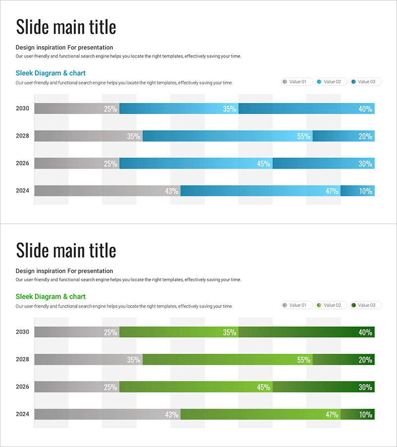
A horizontal bar chart PowerPoint slide that intuitively presents year-over-year segmented data across multiple series. Designed to compare three data series (gray, light blue, dark blue) spanning 2024 to 2030, with percentage values clearly displayed for each year. Ideal for business reports, competitive analysis, market share trends, and sales performance presentations. The 16:9 widescreen format with 2-slide composition integrates seamlessly into presentation flows. All colors, values, and labels are fully editable to accommodate your specific data requirements.
Usage Points
-
Main Usage
Compares multi-series data across years using horizontal bar visualization. Effectively displays market share evolution, competitor performance benchmarks, departmental revenue trends, customer satisfaction changes, and other metrics that shift over time with clear numerical representation.
-
How to Use
Apply to business reports, quarterly earnings presentations, market analysis decks, and executive briefing materials. The year-based rows and color-coded series enable instant comparison. Percentage values are directly editable, allowing you to input your own data while maintaining professional formatting.
-
Recommended For
Marketing managers, business analysts, sales directors, financial officers, management consultants, and data-driven decision makers. Particularly effective for annual trend analysis, market positioning explanations, and competitive strategy development presentations.
-
Slide Structure
2-slide set. Each slide displays 4 years (2030, 2028, 2026, 2024) as horizontal rows. Each year row contains three adjacent bars representing gray (Value 01), light blue (Value 02), and dark blue (Value 03) data series. Percentage labels appear at the bar endpoints for precise data communication.
Related Products
-

Body Organ Analysis Subdivision Graph - Market and Competitor Comparison
#Market and Competitor Analysis #Graph #Competitor Analysis
-

Business Partner Analysis Bar Graph – Market Insights
#Market and Competitor Analysis #Graph #Competitor Analysis
-

Segmented Bar Graph for Market and Competitor Analysis
#Market and Competitor Analysis #Graph #Competitor Analysis
-

Chemical Experiment Analysis Horizontal Bar Graph
#Market and Competitor Analysis #Graph #Competitor Analysis
