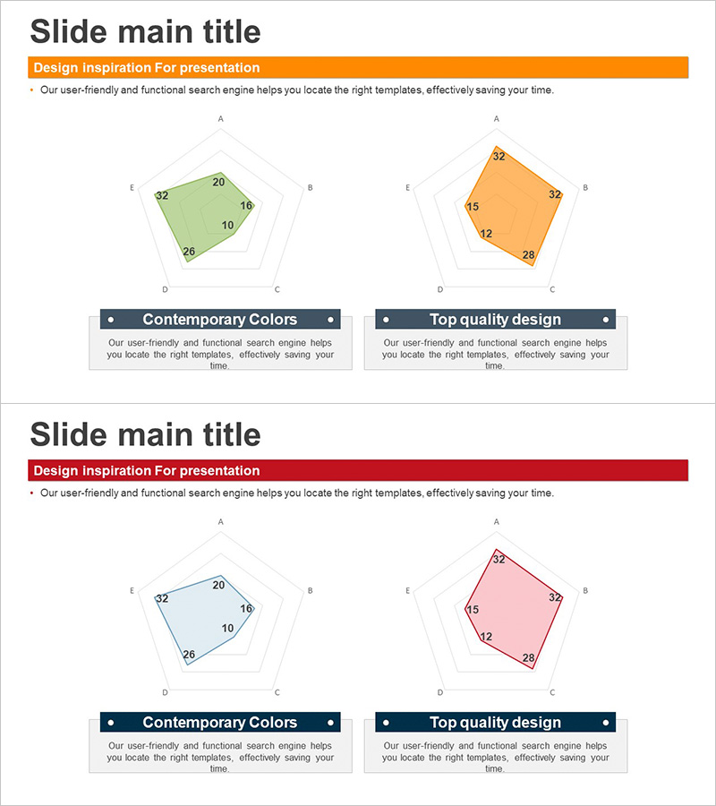
Third Party Comparison Pentagon Area Graph – Competitive Advantage Analysis
RJ0300064_22
- Last Update 05/06/2025
- File Size 0.8MB
- # of Slides 2
- File Format PPTX
- Slide Ratio 16:9
- Color
Keywords
About the Product
A pentagon area chart PowerPoint slide designed for competitive advantage analysis and third-party comparison. This radial area graph displays five key metrics (price, quality, technology, customer satisfaction, market share) to visually contrast your organization against competitors. The two-color design—green and orange—clearly differentiates datasets while maintaining visual clarity. Ideal for market analysis, product benchmarking, and performance evaluation presentations. Includes 2 slides in 16:9 widescreen PPTX format, ready to customize with your data.
Usage Points
-
Main Usage
Enables side-by-side comparison of organizational strengths across five dimensions against competitors. The radial area format makes relative advantages immediately apparent, allowing stakeholders to grasp competitive positioning at a glance without detailed explanation.
-
How to Use
Insert your metrics into the five axes (A, B, C, D, E) and the area automatically adjusts to reflect data. Use in market analysis, competitive strategy, and product comparison decks. Customize colors to represent different competitors or business units. Suitable for executive presentations, client proposals, business plans, and investor pitch decks.
-
Recommended For
Marketing managers, strategy planners, sales executives, consultants, and product development teams presenting competitive analysis to leadership and clients. Particularly effective in B2B proposals and investment pitches where demonstrating competitive advantage is critical.
-
Slide Structure
Two-slide set featuring pentagon radial area charts. First slide displays green area graph; second shows orange area graph. Each chart contains five axes (A, B, C, D, E) with concentric pentagon gridlines. Data areas expand from center outward, enabling intuitive size comparison between datasets.
Related Products
-

Goal Achievement Analysis Area Graph – Data-driven Competitive Edge
#Market and Competitor Analysis #Graph #Other
-

Monthly Volume Overview Area Chart – Essential Tool for Market Analysis
#Market and Competitor Analysis #Graph #Competitor Analysis
-

Cement Theme Area Graph – Data Visualization Emphasizing Competitive Advantage
#Market and Competitor Analysis #Graph #Competitor Analysis
-

Sailing Travel Service Company and Competitor Analysis Dual Horizontal Chart
#Market and Competitor Analysis #Graph #Competitor Analysis
