Monthly Volume Overview Area Chart – Essential Tool for Market Analysis
RJ0300043_21
- Last Update 04/29/2025
- File Size 3MB
- # of Slides 2
- File Format PPTX
- Slide Ratio 16:9
- Color
Keywords
About the Product
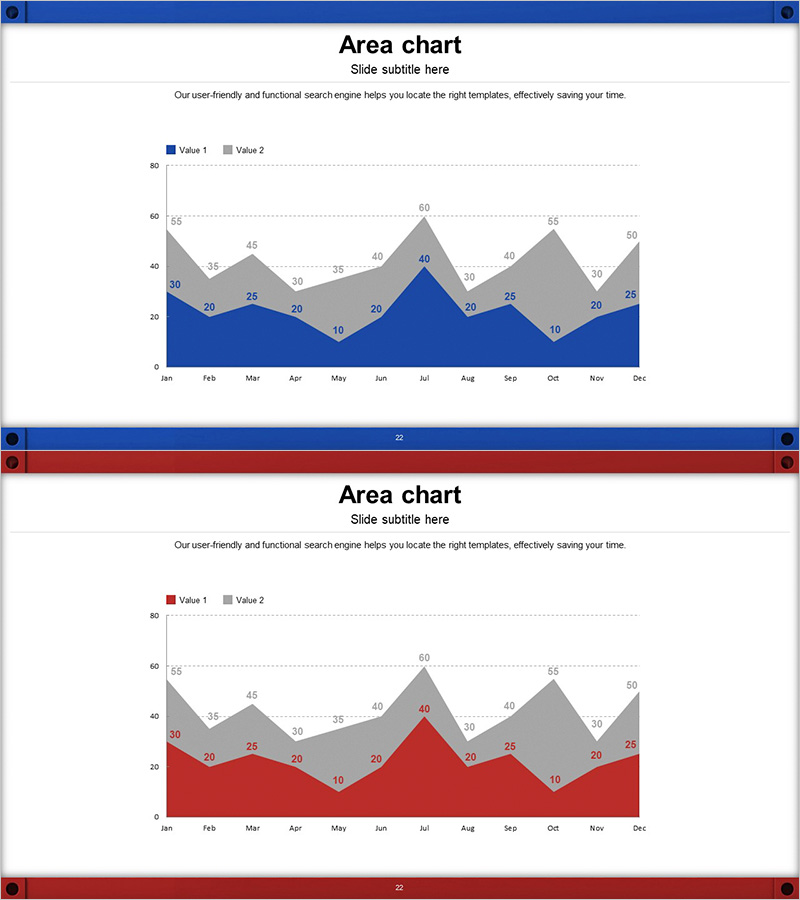
A PowerPoint slide featuring a dual-series area chart that compares monthly data trends across two data sets. The chart uses blue and gray gradient areas to visualize cumulative time-series data with clear data point labels. This presentation slide effectively displays 12-month periods with precise numerical values, making it ideal for business metrics such as logistics volume, sales performance, and market share analysis. The 16:9 widescreen format includes 2 slides ready for immediate use in professional presentations.
Usage Points
-
Main Usage
This area chart simultaneously displays cumulative trends and comparisons between two data series over time. It effectively shows monthly, quarterly, or annual changes and is optimized for business metrics including logistics volume, sales revenue, market share, and customer growth. The stacked area format makes it easy to see both individual series performance and total combined values.
-
How to Use
Use this slide in market analysis sections to compare competitive performance trends, or in business reports to explain monthly and quarterly results. Simply edit the title, subtitle, and data values to match your presentation context. The legend and axis labels are fully editable, allowing quick customization for your specific data and messaging.
-
Recommended For
Ideal for executive reports, business performance presentations, market analysis documents, marketing plans, and financial reports. Particularly valuable for logistics, distribution, retail, finance, and manufacturing sectors. Recommended for analysts, planners, marketers, and finance professionals presenting data-driven insights and quantitative evidence.
-
Slide Structure
Both slides feature identical dual-series area chart layouts. The chart consists of two gradient-filled areas: blue (Value 1) and gray (Value 2). The X-axis displays 12 months (January through December), while the Y-axis shows a 0-80 numerical scale. Each data point includes precise value labels, with legend and subtitle areas included for context.
Related Products
-

Goal Achievement Analysis Area Graph – Data-driven Competitive Edge
#Market and Competitor Analysis #Graph #Other
-

Third Party Comparison Pentagon Area Graph – Competitive Advantage Analysis
#Market and Competitor Analysis #Graph #Competitor Analysis
-

Cement Theme Area Graph – Data Visualization Emphasizing Competitive Advantage
#Market and Competitor Analysis #Graph #Competitor Analysis
-

Sailing Travel Service Company and Competitor Analysis Dual Horizontal Chart
#Market and Competitor Analysis #Graph #Competitor Analysis
