Percentage Visualization with Donut Charts
RJ0300043_29
- Last Update 04/29/2025
- File Size 2.9MB
- # of Slides 2
- File Format PPTX
- Slide Ratio 16:9
- Color
Keywords
- #Content-Based Slides
- #Design-Based Slides
- #Market and Competitor Analysis
- #Customer Success Stories
- #Graph
- #Customer Analysis
- #Customer Testimonials and Feedback
- #Circles
- #Other
- #Doughnut Chart
- #Other Charts
- #16:9
- #donut chart PowerPoint slide
- #pie chart presentation template
- #percentage visualization slides
- #data comparison PowerPoint
- #how to create donut chart in PowerPoint
About the Product
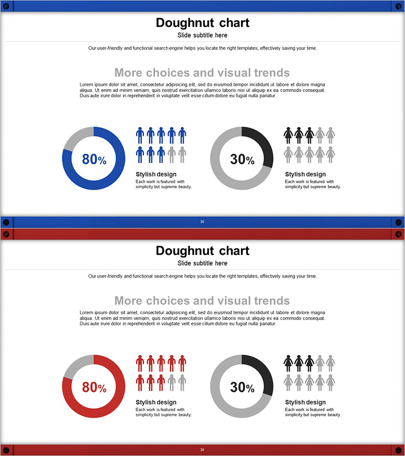
Visualize proportions and composition intuitively with this donut chart PowerPoint slide template. Two layout variations featuring blue, red, and gray color schemes effectively display numerical comparisons for customer analysis, case studies, and market research presentations. Each slide combines two donut charts with human icons to clearly communicate demographic, gender, and preference data across categories. Available in 16:9 widescreen PPTX format, fully editable with customizable text and numerical values for immediate use in business presentations.
Usage Points
-
Main Usage
Express proportions and composition clearly through donut chart visualization. Paired with human icons for optimal demographic, gender, and customer segment analysis. Three color combinations (blue, red, gray) enable contrasting numerical representation and multi-category comparison.
-
How to Use
Apply in business reports, marketing plans, and customer analysis documents to represent percentage data. Replace donut chart values and labels with your own data, adjust human icon quantities to reflect actual sample sizes, and modify color schemes to match corporate branding while maintaining visual hierarchy.
-
Recommended For
Ideal for marketing teams presenting customer segmentation analysis, HR teams showing organizational composition, sales teams displaying regional or product sales ratios, and strategy teams presenting market share analysis. Suitable for all business presentations requiring intuitive quantitative data communication.
-
Slide Structure
Each slide features two donut charts (80% blue/red and 30% gray) with human icon arrangements. Left chart displays primary data while right chart shows comparative data, with 'Stylish design' descriptive text beneath each chart. 16:9 widescreen format with balanced left-right spacing and professional layout proportions.
Related Products
-

User Analysis Pictogram Graph – Visualizing Customer Success
#Market and Competitor Analysis #Customer Success Stories #Graph
-

User Gender Ratio Analysis Graph – Visualizing Market Share
#Market and Competitor Analysis #Graph #Customer Analysis
-

Blue Green Tone User Evaluation Diagram – Customer Analysis and Feedback
#Market and Competitor Analysis #Customer Success Stories #Graph
-

Customer Evaluation and Feedback on Renewable Energy Business - Doughnut Chart
#Market and Competitor Analysis #Customer Success Stories #Graph
