Customer Analysis by Service – Insights Visualization with Data
RJ0300010_19
- Last Update 04/20/2025
- File Size 1MB
- # of Slides 2
- File Format PPTX
- Slide Ratio 16:9
- Color
Keywords
- #Content-Based Slides
- #Design-Based Slides
- #Market and Competitor Analysis
- #Customer Success Stories
- #Graph
- #Customer Analysis
- #Customer Testimonials and Feedback
- #Other
- #Other Charts
- #16:9
- #infographic customer analysis PowerPoint
- #ratio comparison slide
- #customer analysis presentation
- #silhouette chart
- #data visualization slide template
About the Product
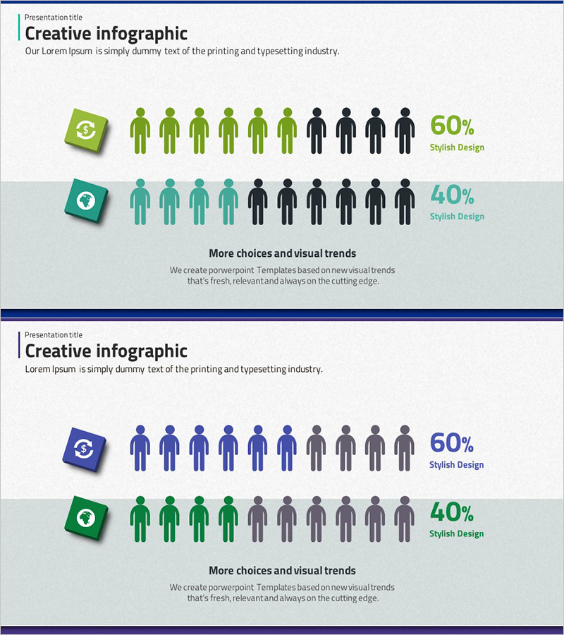
A data visualization PowerPoint slide that presents customer distribution by service using infographic elements. The slide features green and teal-colored icon boxes paired with human silhouettes, clearly displaying customer ratios of 60% versus 40%. This 2-slide presentation deck is designed for immediate use in marketing analysis, market research, and customer segmentation presentations. The visual layout combines icon indicators with silhouette figures to make customer composition instantly comprehensible for stakeholders.
Usage Points
-
Main Usage
This slide delivers service-based customer composition ratios through intuitive visual representation. Using icon boxes and human silhouettes, it expresses customer distribution at 60% versus 40%, making it suitable for decision-making presentations and strategic planning documents.
-
How to Use
Deploy this slide in marketing strategy presentations, customer analysis reports, and market research findings. It works effectively when comparing customer characteristics across services or presenting data-driven insights in business analysis sections. Easily customize the percentages and labels in PowerPoint to match your actual data.
-
Recommended For
Marketing managers, business analysts, sales directors, and executives presenting customer segmentation strategies will find this slide valuable. Ideal for startup pitches, internal corporate meetings, and client presentations where clear customer composition data is essential.
-
Slide Structure
Two-slide layout with left-aligned icon boxes (green and teal), center-positioned human silhouettes (10 figures with color differentiation), and right-aligned percentage text (60% and 40%). Clear information hierarchy with title area at top and descriptive text zone at bottom.
Related Products
-

Percentage Visualization with Donut Charts
#Market and Competitor Analysis #Customer Success Stories #Graph
-

Blue Green Tone User Evaluation Diagram – Customer Analysis and Feedback
#Market and Competitor Analysis #Customer Success Stories #Graph
-

User Analysis Pictogram Graph – Visualizing Customer Success
#Market and Competitor Analysis #Customer Success Stories #Graph
-

Gender Comparison Analysis Pairwise Bar Graph – Understanding Customers' First Step
#Market and Competitor Analysis #Customer Success Stories #Graph
