Market Share Analysis Graph & Table – Enhancing Understanding through Data Visualization
RJ0300032_18
- Last Update 04/27/2025
- File Size 6MB
- # of Slides 2
- File Format PPTX
- Slide Ratio 16:9
- Color
Keywords
- #Content-Based Slides
- #Design-Based Slides
- #Product/Service Introduction
- #Market and Competitor Analysis
- #Diagram
- #Graph
- #Development Status
- #Market Share
- #Table
- #Circles
- #Horizontal Table
- #Pie Chart
- #16:9
- #pie chart PowerPoint slide
- #circular graph template
- #market share analysis chart
- #data visualization slide
- #proportion diagram PowerPoint
About the Product
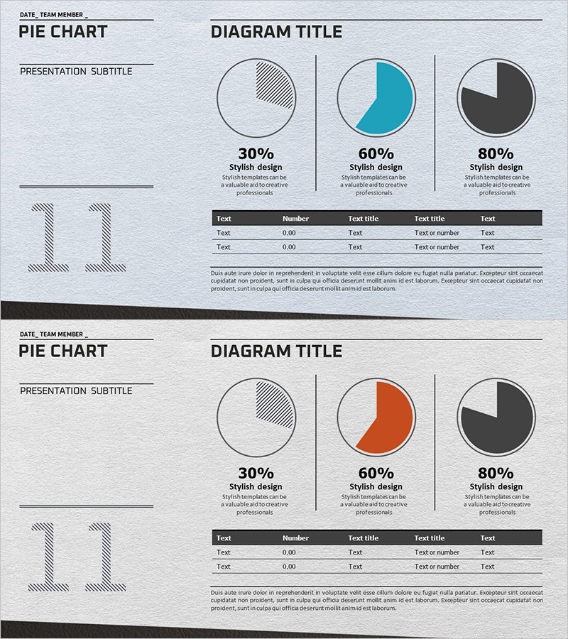
A 2-slide PowerPoint template set for market share analysis featuring pie charts and data tables. The slides display three circular graphs representing 30%, 60%, and 80% proportions, paired with editable data tables for immediate use in numerical presentations. The design uses teal and charcoal tones to establish clear information hierarchy, with each slide including title, subtitle, description areas, and customizable text input fields. Provided in 16:9 widescreen PPTX format, this template is ideal for business reports, marketing plans, quarterly performance presentations, and any context requiring visual communication of data-driven insights and comparative analysis.
Usage Points
-
Main Usage
Visualize proportional relationships such as market share, sales distribution, and customer composition through pie charts. The template presents three segmentation ratios (30%, 60%, 80%) on a single slide, enabling intuitive comparison of relative data magnitudes.
-
How to Use
Apply to market analysis sections in marketing plans, sales performance pages in quarterly reports, and customer composition slides in investor pitch decks. Input actual figures into the table area to present quantitative evidence alongside pie chart proportions.
-
Recommended For
Marketing managers, sales directors, financial analysts, and executives presenting market conditions, sales performance, and customer distribution. Particularly effective for competitive market share comparisons, product revenue breakdowns, and regional customer distribution visualization.
-
Slide Structure
Each slide features a title and subtitle area at the top, three pie charts in the center (representing 30%, 60%, and 80% proportions), and a data table at the bottom (5 rows × 5 columns). Teal, charcoal, and light gray tones establish information priority, with all text and numerical fields fully editable.
Related Products
-

Development Status Analysis Pie Type 3D Graph
#Product/Service Introduction #Market and Competitor Analysis #Graph
-

Development Status Pie Chart – Visualizing Product Progress
#Product/Service Introduction #Market and Competitor Analysis #Graph
-

Development Status Analysis Circle Graph
#Product/Service Introduction #Market and Competitor Analysis #Graph
-

Market Share Circle Pie Chart
#Product/Service Introduction #Market and Competitor Analysis #Graph
