Business Technology Status Bar Graph – Insights Delivered Through Data Visualization
RJ0300032_16
- Last Update 04/27/2025
- File Size 6MB
- # of Slides 2
- File Format PPTX
- Slide Ratio 16:9
- Color
Keywords
- #Content-Based Slides
- #Design-Based Slides
- #Product/Service Introduction
- #Business Introduction
- #Graph
- #Composition
- #Technological Status
- #Horizontal Bar
- #Segmented Horizontal Bar
- #16:9
- #horizontal bar chart PowerPoint
- #data visualization slides
- #business metrics chart
- #year-over-year comparison
- #how to create bar chart in PowerPoint
About the Product
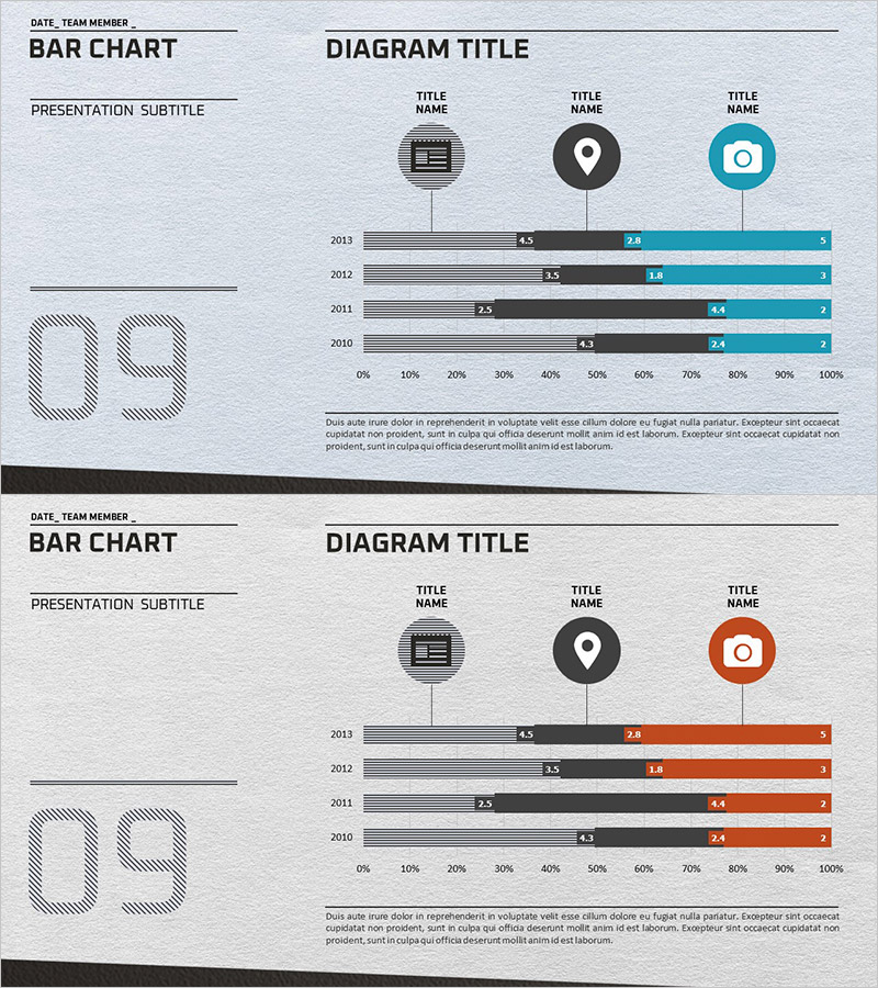
A horizontal bar chart PowerPoint slide for visualizing business technology status and performance metrics. This presentation template displays data across four years (2010–2013) using three distinct color series (gray, black, and teal), enabling clear year-over-year comparison and trend analysis. Category icons (document, location, camera) at the top provide visual segmentation, while a 0%–100% scale axis ensures accurate ratio representation. Ideal for corporate presentations, technology status reports, performance reviews, and strategic business communications that require data-driven insights.
Usage Points
-
Main Usage
Enables side-by-side comparison of numerical data across years and categories, with three-series trend visualization for quick insight into performance changes. Optimized for technology status, KPI tracking, market share analysis, budget allocation, and multi-dimensional business metrics.
-
How to Use
Enter presentation title, subtitle, date, and team information in the left panel. Edit the three bar series values and labels in the right graph area to match your data. Colors and scale are fully customizable to align with your corporate branding and data range.
-
Recommended For
Executive briefings, quarterly and annual performance reviews, technology landscape assessments, marketing analytics presentations, investor pitch decks, and consulting proposals. Ideal for executives, business analysts, marketing professionals, and strategy teams presenting quantitative data.
-
Slide Structure
Two-slide deck with consistent layout: left information panel (title, subtitle, date, team, large numeric display) and right graph area (4 year rows × 3 color-coded bar series × numeric labels). Uses gray, black, and teal color palette with 0–100% horizontal axis scale.
Related Products
-

Composition Content Bar Graph – Information Delivery and Analysis
#Product/Service Introduction #Business Introduction #Graph
-

4-Step Business Process Graph – Market Analysis and Technology Status
#Business Introduction #Market and Competitor Analysis #Graph
-

Content Composition Breakdown by Year with Horizontal Bar Chart
#Business Introduction #Market and Competitor Analysis #Graph
-

Data Analysis Segmented Bar Graph – Technology Status and Analysis
#Product/Service Introduction #Business Introduction #Graph
