Cargo Transportation Service Analysis Graph – Detailed Data Comparison
RJ0300030_17
- Last Update 04/26/2025
- File Size 1.1MB
- # of Slides 2
- File Format PPTX
- Slide Ratio 16:9
- Color
Keywords
- #Content-Based Slides
- #Design-Based Slides
- #Market and Competitor Analysis
- #Graph
- #Market Analysis
- #Column
- #Segmented Column
- #16:9
- #stacked column chart PowerPoint
- #multi-layer data comparison slide
- #cumulative bar chart template
- #how to create stacked chart in PowerPoint
- #data visualization slide download
About the Product
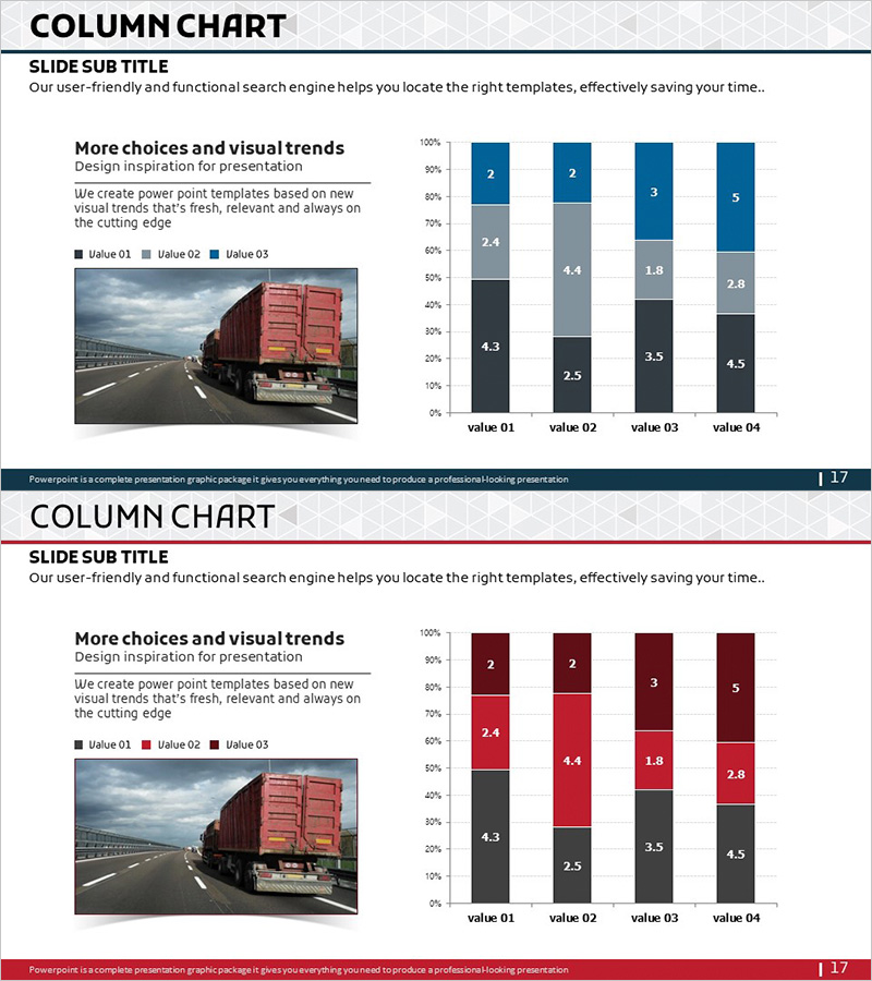
A stacked column chart PowerPoint slide designed for cargo transportation service analysis and detailed data visualization. This presentation template displays 4 items with 3 data layers in a cumulative bar format, enabling clear comparison across service categories and metrics. The chart uses a three-color scheme (black, gray, and blue) to distinguish data layers, with numerical labels displayed on each bar segment for precise information delivery. Ideal for market analysis, competitive benchmarking, business performance reports, and professional presentations requiring multi-dimensional data visualization.
Usage Points
-
Main Usage
This slide is optimized for comparing and analyzing multi-dimensional data across service categories, such as revenue, transaction volume, or customer count by transportation type. It enables clear presentation of complex datasets to support data-driven decision-making in business contexts.
-
How to Use
Simply replace the color-coded data layers and numerical values with your own dataset. The left side provides space for title, subtitle, and descriptive text, while the right side features a fully editable chart object that can be customized with your specific data points and labels.
-
Recommended For
Recommended for logistics, transportation, and distribution company executive reports, market analysis presentations, competitive analysis briefings, business performance evaluations, investor pitch decks, and any professional presentation requiring multi-layer data comparison and visualization.
-
Slide Structure
2-slide set with consistent layout. Each slide is divided into left text area (title, subtitle, description) and right chart area. The stacked column chart features 4 items on the X-axis, 0-100% range on the Y-axis, with each bar composed of 3 color-coded segments (black, gray, blue) and numerical labels for each layer.
Related Products
-

Visualization of Learning Response Data – Market Trend Analysis
#Market and Competitor Analysis #Graph #Future Outlook
-

Tablet PC Mockup Vertical Bar Graph – Market Analysis and Tech Insights
#Business Introduction #Market and Competitor Analysis #Graph
-

Big Data Market Analysis Graph – Trends and Performance
#Market and Competitor Analysis #Financial Plans and Performance #Diagram
-

Vertical Bar Chart Visualizing Monthly Performance – Contemporary Design
#Product/Service Introduction #Market and Competitor Analysis #Graph
