Free Graph of Yearly Change Figures – Visualization for Data Comparison
RJ0300027_34
- Last Update 04/25/2025
- File Size 0.4MB
- # of Slides 2
- File Format PPTX
- Slide Ratio 16:9
- Color
Keywords
About the Product
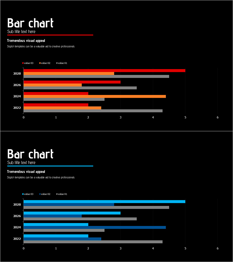
A horizontal bar chart PowerPoint slide that visualizes year-over-year change figures with clarity and impact. Displays data from 2022 to 2028 across three distinct data series, color-coded in red, orange, and blue tones against a black background for maximum contrast. Includes a numeric axis from 0 to 6 and a clear legend for immediate comprehension. Perfect for business reports, performance analysis, market research presentations, and quarterly reviews. The 16:9 widescreen format with 2-slide composition integrates seamlessly into any presentation flow.
Usage Points
-
Main Usage
Compare multiple data series over time, such as annual sales, performance metrics, or revenue trends. Horizontal bars enable intuitive size comparison while color differentiation helps viewers track each series' progression at a glance.
-
How to Use
Insert into business performance reports, marketing strategy presentations, investor pitch decks, quarterly earnings reviews, and comparative analysis slides. Simply replace the sample data and values with your own figures; the template structure remains intact for quick customization.
-
Recommended For
Finance professionals, marketing strategists, sales managers, executive presenters, management consultants, and data analysts who need to communicate quantitative results persuasively. Ideal for annual performance comparisons, departmental benchmarking, and market research findings.
-
Slide Structure
Two-slide set featuring distinct color schemes: Slide 1 uses red, orange, and black bars; Slide 2 uses blue, gray, and black bars. Both display 4 years (2022–2028) on the Y-axis, numeric scale (0–6) on the X-axis, with title area and legend included for complete data context.
Related Products
-

THE ROAD Presentation Table & Tied Vertical Bar Graph – Market and Competitor Analysis
#Market and Competitor Analysis #Diagram #Graph
-

Work Stress Visualized with Line Chart – Analysis and Competitive Advantage
#Market and Competitor Analysis #Graph #Market Status
-

Gender Ratio Bar Graph – Market and Competitor Analysis
#Market and Competitor Analysis #Graph #Competitor Analysis
-

Camera Usage App Analysis – Innovation and Insight
#Product/Service Introduction #Diagram #Graph
