Graph of the Status of European Target Region Analysis – Market Trends Visualization
RJ0300046_20
- Last Update 04/30/2025
- File Size 4MB
- # of Slides 2
- File Format PPTX
- Slide Ratio 16:9
- Color
Keywords
- #Content-Based Slides
- #Design-Based Slides
- #Market and Competitor Analysis
- #Marketing Plan and Strategy
- #Graph
- #Other
- #Target Market
- #Target Market Strategy
- #Circles
- #Doughnut Chart
- #Map
- #16:9
- #Europe map PowerPoint slide
- #distribution map template
- #location marker presentation
- #donut chart slide
- #regional analysis PowerPoint
- #world map slide download
- #geographic data visualization
About the Product
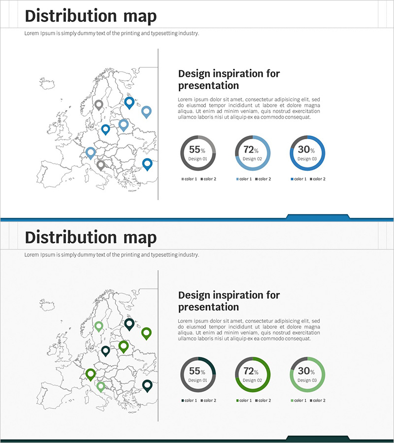
A PowerPoint slide featuring a European map with location markers and donut charts visualizing regional data. This 2-slide set uses a blue and green color palette to present geographic distribution and performance metrics clearly. The vertical split layout separates the map and chart information, making it easy for audiences to understand regional analysis and market trends. Compatible with all presentation environments in 16:9 widescreen PPTX format, ready for immediate use in business reports and strategic presentations.
Usage Points
-
Main Usage
Display European market conditions, sales distribution, and customer locations using integrated map and chart visualization. Location markers highlight key business hubs while donut charts present regional proportions and composition data intuitively for strategic planning and performance reporting.
-
How to Use
Insert into marketing plans, business reports, and market analysis documents in the regional overview section. Edit marker positions and chart values with actual data for immediate presentation use. Customize colors to match your brand identity without affecting the layout structure.
-
Recommended For
Marketing managers, sales directors, and executives presenting regional market trends, sales performance, and customer distribution. Ideal for international business strategies, European market entry plans, and global expansion presentations.
-
Slide Structure
Both slides feature identical layout with European map (borders and grid lines) with mixed-color location pins (blue, gray, green) on the left side, and title, descriptive text with three donut charts (displaying 55%, 72%, 30% data) on the right. A vertical divider line clearly separates map and chart zones for visual clarity.
Related Products
-

Infographic Slide for Regional Data Visualization
#Market and Competitor Analysis #Marketing Plan and Strategy #Graph
-

Analysis of European Target Regions – Insights for Marketing Strategy Development
#Market and Competitor Analysis #Marketing Plan and Strategy #Graph
-

Area Graph for Competitor Analysis
#Market and Competitor Analysis #Marketing Plan and Strategy #Graph
-

Slide Visualizing America with Contemporary Colors
#Market and Competitor Analysis #Marketing Plan and Strategy #Graph
