Snow Mountain Themed Grouping Bar Graph – Ideal for Competitor Analysis
RJ0300026_8
- Last Update 04/25/2025
- File Size 1.4MB
- # of Slides 2
- File Format PPTX
- Slide Ratio 16:9
- Color
Keywords
About the Product
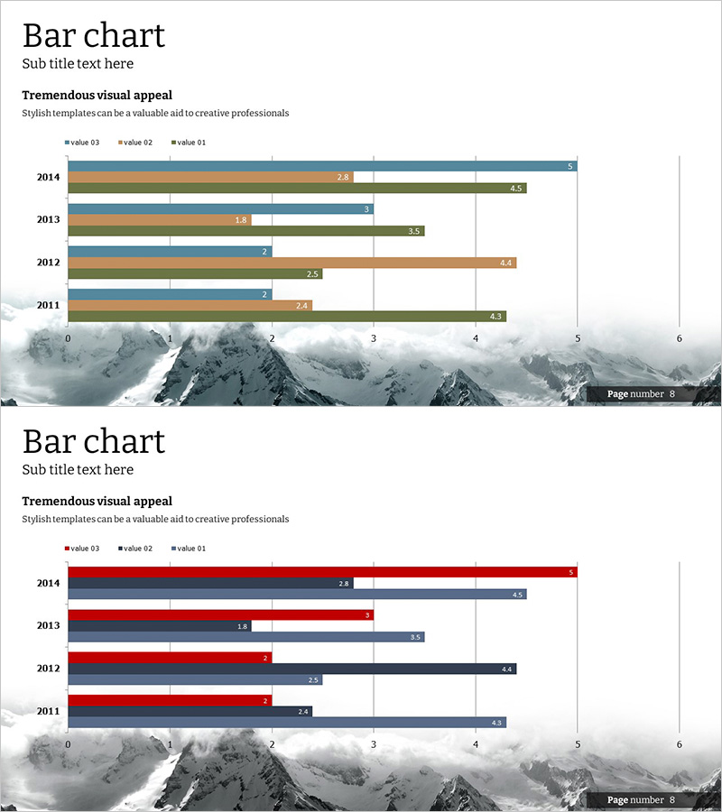
This free PowerPoint slide features a grouped bar chart with a serene snow mountain background, perfect for comparing three data series across multiple years. Ideal for competitor analysis, market comparison, and performance tracking, this presentation slide allows you to simply replace the text and values to create professional data visualizations. The blue, beige, and green color scheme conveys expertise and credibility, while gridlines enhance data readability. Download this free chart slide and insert it directly into your business presentations, reports, or pitch decks. Explore more graph slide templates and comprehensive chart collections on GoodPello.
Usage Points
-
Main Usage
Visualize and compare three or more data series simultaneously, such as competitor metrics, market trends, or year-over-year performance across multiple categories.
-
How to Use
Replace the years (2011–2014) and legend labels (value 01/02/03) with your own data, then input the corresponding values for each bar. Insert into business plans, investor presentations, or quarterly reports to strengthen data-driven arguments.
-
Recommended For
Business analysts, marketing managers, executives, consultants, and professionals who need to present comparative data analysis. Suitable for business plans, investment pitch decks, performance reports, and market analysis presentations.
-
Slide Structure
Single-slide design featuring a horizontal grouped bar chart with 4 years × 3 data series layout. Snow mountain background with gridlines and data labels clearly displayed for immediate editing and professional presentation.
Related Products
-

Competitive Advantage Bar General Graph – Emphasizing Performance through Market Analysis
#Free Graphs
-

Comparative Analysis Bar Graph – Market and Competitor Analysis
#Free Graphs
-

Market Analysis by Year Horizontal Bar Graph
#Free Graphs
-

Business Comparison Analysis Graph – Strengthening Market and Competitor Analysis
#Free Graphs
