Blood Donation Status Analysis Pie Chart
RJ0400029_9
- Last Update 05/25/2025
- File Size 0.4MB
- # of Slides 2
- File Format PPTX
- Slide Ratio 16:9
- Color
Keywords
- #Content-Based Slides
- #Design-Based Slides
- #Product/Service Introduction
- #Market and Competitor Analysis
- #Graph
- #Development Status
- #Market Share
- #Circles
- #Pie Chart
- #16:9
- #pie chart PowerPoint slide
- #pie graph template
- #data visualization slide
- #ratio comparison chart
- #blood donation analysis presentation
About the Product
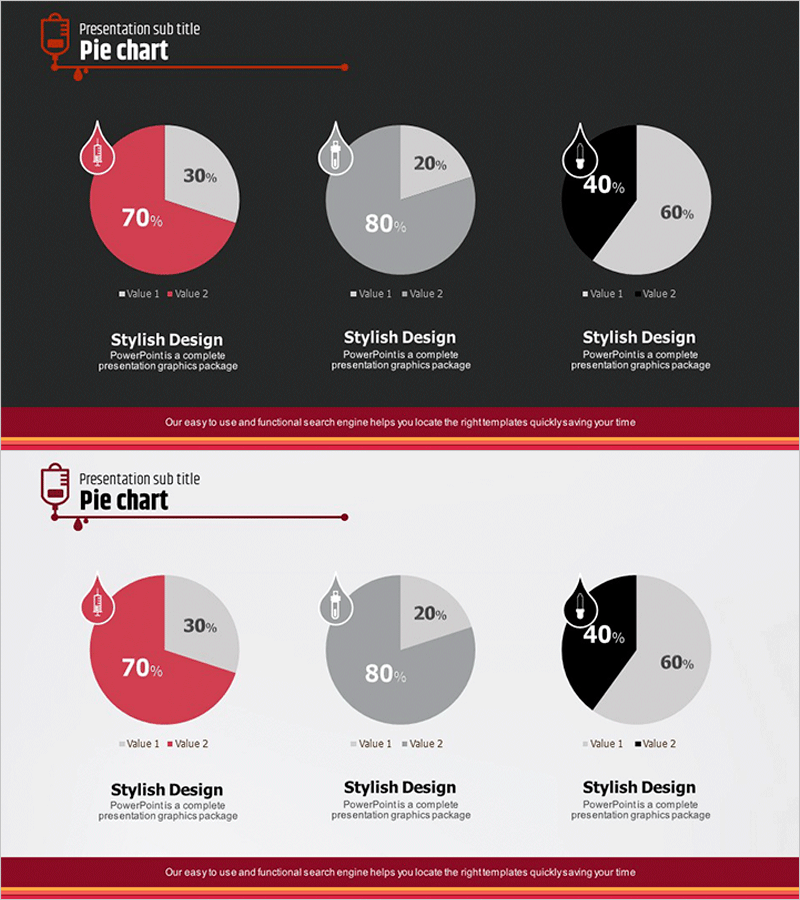
A 2-slide pie chart PowerPoint template designed for blood donation status analysis and market data comparison. The dark gray background features three color-coded pie charts in red, gray, and black, enabling intuitive ratio visualization. Each slide displays two pie charts with drop icons and legends to clearly distinguish data categories. Provided in 16:9 widescreen PPTX format, optimized for modern presentation environments. Immediately applicable for blood donation statistics, blood type distribution, donation fund status, and other ratio-based information delivery.
Usage Points
-
Main Usage
Expresses ratio data and composition proportions through pie charts to enhance audience comprehension. Ideal for comparing two items simultaneously such as blood donation statistics, blood type distribution, donation fund status, and market share analysis.
-
How to Use
Input actual data values into the pie charts on the dark gray background, and proportions automatically update. Use drop icons and legends to clearly distinguish data categories while maintaining consistent color coding throughout the presentation.
-
Recommended For
Recommended for healthcare institution blood donation status reports, statistical agency data presentations, marketing team market share comparisons, finance team budget allocation reports, and educational institution student composition analysis.
-
Slide Structure
2-slide composition with two pie charts per slide (example ratios: 70%-30%, 80%-20%, 60%-40%), including drop icons, legends (Value 1, Value 2), and descriptive text areas. 16:9 widescreen PPTX format.
Related Products
-

Pie Chart of the Development Status of the Snow Mountain Theme
#Product/Service Introduction #Market and Competitor Analysis #Diagram
-

Development Status Pie Chart – Efficient Data Delivery
#Product/Service Introduction #Market and Competitor Analysis #Graph
-

Purchase Volume Comparison Analysis Circle Graph – Understanding Market Share
#Product/Service Introduction #Market and Competitor Analysis #Graph
-

4 Donut Charts for Data Visualization – Easy Presentation Template
#Product/Service Introduction #Market and Competitor Analysis #Graph
