Market Share Analysis Graph – Effective Market Insights
RJ0300016_7
- Last Update 04/22/2025
- File Size 1.4MB
- # of Slides 2
- File Format PPTX
- Slide Ratio 16:9
- Color
Keywords
- #Content-Based Slides
- #Design-Based Slides
- #Market and Competitor Analysis
- #Graph
- #Market Share
- #Market Analysis
- #Circles
- #Pie Chart
- #16:9
- #pie chart PowerPoint slide
- #circular graph presentation
- #market share analysis chart
- #data visualization slide
- #proportion representation PPT
- #pie chart template download
About the Product
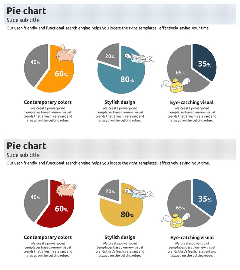
A pie chart PowerPoint slide set designed to visualize market share and data proportions with clarity and impact. Three pie charts per slide use a color palette of orange, teal, navy, and gray to represent different market analysis perspectives. The 2-slide set is ready for immediate use in presentations requiring ratio-based data visualization such as market analysis, customer segmentation, and competitive positioning. Each pie chart displays percentage values and labels clearly, enhanced with icon elements for improved visual comprehension. Delivered in 16:9 widescreen PPTX format compatible with all presentation environments.
Usage Points
-
Main Usage
Effectively visualizes proportional relationships such as market share, customer composition, revenue distribution, and product category sales ratios. Ideal for executive reports, investor presentations, and marketing strategy briefings where data-driven decision-making is essential.
-
How to Use
Edit the percentage values and labels in each pie chart with your own data for immediate deployment. The color scheme can be retained as-is or customized to match your corporate brand colors. Icons can be added, removed, or modified to align with your presentation context.
-
Recommended For
Finance teams presenting revenue composition analysis, marketing teams reporting market segmentation, executive presentations of quarterly performance, investor briefings on business portfolio, and consulting firms presenting market research findings.
-
Slide Structure
2-slide set with 3 pie charts per slide. Each chart contains 2-4 segment divisions. Slide 1 features orange-gray, teal-gray, and navy-gray two-color combinations. Slide 2 features red-gray, gold-gray, and navy-gray combinations. Each segment includes percentage values, descriptive labels, and supporting icons for enhanced visual communication.
Related Products
-

A Lively Green Orange Pie Chart
#Market and Competitor Analysis #Graph #Market Share
-

Market Share and Analysis Graph – Blue, Orange, Green
#Market and Competitor Analysis #Graph #Market Share
-

Design Pattern Template Pie Chart – Market Share Analysis
#Market and Competitor Analysis #Graph #Market Share
-

Market Share Circle Graph – Ideal for Market Analysis
#Market and Competitor Analysis #Graph #Market Share
