User Analysis Pictogram Graph – Visualizing Customer Success
RJ0300052_10
- Last Update 05/02/2025
- File Size 4.3MB
- # of Slides 2
- File Format PPTX
- Slide Ratio 16:9
- Color
Keywords
- #Content-Based Slides
- #Design-Based Slides
- #Market and Competitor Analysis
- #Customer Success Stories
- #Graph
- #Other
- #Customer Analysis
- #Customer Testimonials and Feedback
- #Other
- #Other Charts
- #16:9
- #pictogram chart PowerPoint
- #infographic slide template
- #user analysis diagram
- #ratio comparison chart
- #customer success visualization PowerPoint slide
About the Product
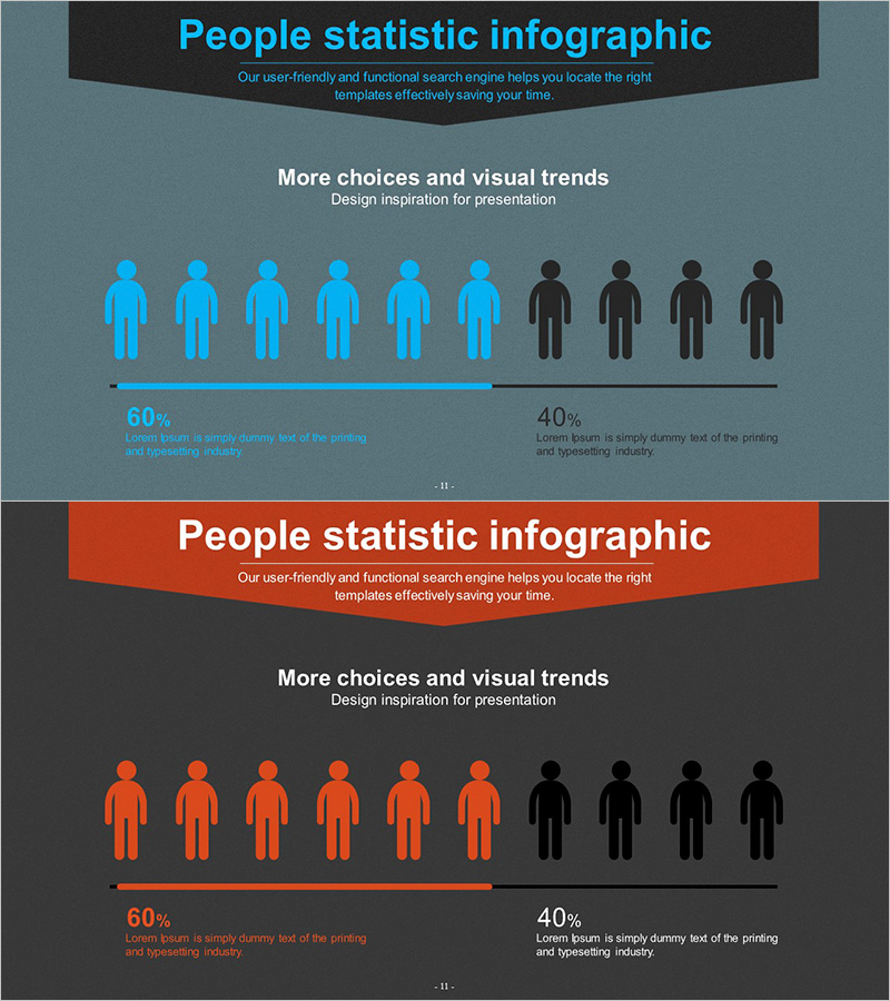
A user analysis PowerPoint slide that visualizes data through pictogram icons representing 10 people. This presentation template clearly displays ratio comparisons such as 60% vs 40% using silhouette figures in contrasting colors—blue and black, or orange and black. The 2-slide set provides the same layout in two color schemes, allowing you to match your presentation's visual identity. Ideal for customer success metrics, user distribution analysis, market share representation, and demographic breakdowns in business reports and investor presentations.
Usage Points
-
Main Usage
Visualize user analysis data and customer success metrics using intuitive pictogram icons. The 10-figure silhouette layout enables audiences to instantly grasp ratio-based information, making it ideal for marketing reports, business performance presentations, and customer analysis decks.
-
How to Use
Simply edit the percentage values and descriptive text to match your data. Choose between the blue or orange color scheme based on your brand guidelines, and adjust the number and color arrangement of the pictogram figures as needed for your specific metrics.
-
Recommended For
Marketing teams presenting user analysis reports, sales teams showcasing customer success stories, executive performance briefings, market research presentations, customer satisfaction analysis, and any business presentation requiring ratio-based data visualization.
-
Slide Structure
2-slide template with identical layouts in different color schemes. Each slide features a title area at the top, 10 centered pictogram figures (6 colored + 4 black), and percentage values (60% / 40%) with descriptive text at the bottom for easy customization.
Related Products
-

Business Partner Customer Reviews – Simple and Stylish Design
#Market and Competitor Analysis #Customer Success Stories #Diagram
-

Data Visualization Slide Template Featuring World Map
#Market and Competitor Analysis #Graph #Other
-

User Analysis Results Diagram - Infographic for Customer Insights
#Market and Competitor Analysis #Graph #Other
-

Global User Status Analysis Graph – Data Visualization
#Market and Competitor Analysis #Graph #Other
