Blue Green Tone User Evaluation Diagram – Customer Analysis and Feedback
RJ0200019_13
- Last Update 04/02/2025
- File Size 7.2MB
- # of Slides 2
- File Format PPTX
- Slide Ratio 16:9
- Color
Keywords
- #Content-Based Slides
- #Design-Based Slides
- #Market and Competitor Analysis
- #Customer Success Stories
- #Graph
- #Customer Analysis
- #Customer Testimonials and Feedback
- #Other
- #Other Charts
- #16:9
- #user evaluation diagram PowerPoint
- #customer analysis slide template
- #comparison chart PPT
- #feedback visualization slide
- #infographic diagram download
About the Product
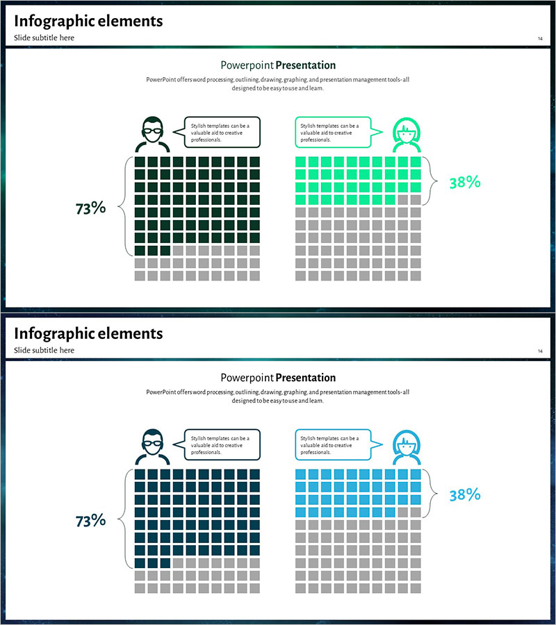
A user evaluation comparison diagram PowerPoint slide designed for customer analysis and feedback visualization. This slide presents two users side-by-side using contrasting blue and green tones, with each user's satisfaction level represented through a grid-based chart. Speech bubbles convey user opinions intuitively, while percentage metrics (73%, 38%) emphasize data-driven insights. The slide features user icons, callout text boxes, and a structured grid layout that makes it ideal for customer feedback analysis sections in presentations, reports, and business proposals.
Usage Points
-
Main Usage
Quantitatively compare satisfaction levels and evaluation metrics between customer or user groups. The contrasting blue and green color scheme clearly differentiates two populations, while the grid chart combined with percentage data delivers data-driven insights effectively.
-
How to Use
Apply this slide when presenting customer satisfaction survey results, user feedback analysis, or A/B test comparisons. Edit the speech bubbles next to user icons with actual feedback, modify grid cell colors to reflect real data, and insert into reports, proposals, or marketing presentations to enhance audience comprehension.
-
Recommended For
Recommended for marketing teams conducting customer segmentation analysis, product teams organizing user feedback, executive reports presenting performance metrics, and consulting proposals outlining current situation assessments. Particularly effective when comparing two alternatives, populations, or time periods.
-
Slide Structure
2-slide set. First slide positions blue-tone user (73% satisfaction) and green-tone user (38% satisfaction) side-by-side, each with user icon, speech bubble, 10×10 grid chart, and percentage metric. Second slide repeats the identical structure with color variations (blue to dark blue, green to teal) for flexible presentation scenarios.
Related Products
-

Customer Analysis by Service – Insights Visualization with Data
#Market and Competitor Analysis #Customer Success Stories #Graph
-

User Analysis Pictogram Graph – Visualizing Customer Success
#Market and Competitor Analysis #Customer Success Stories #Graph
-

Percentage Visualization with Donut Charts
#Market and Competitor Analysis #Customer Success Stories #Graph
-

Flower Wedding Party Customer Assessment – Voice of the Customer
#Market and Competitor Analysis #Customer Success Stories #Diagram
