Mobile Services Market Analysis Bar Graph
RJ0300010_10
- Last Update 04/20/2025
- File Size 4.1MB
- # of Slides 2
- File Format PPTX
- Slide Ratio 16:9
- Color
Keywords
- #Content-Based Slides
- #Design-Based Slides
- #Market and Competitor Analysis
- #Graph
- #Competitor Analysis
- #Market Analysis
- #Horizontal Bar
- #Segmented Horizontal Bar
- #16:9
- #horizontal bar chart PowerPoint
- #bar graph slide template
- #data comparison chart
- #market analysis graph
- #PowerPoint chart slide download
About the Product
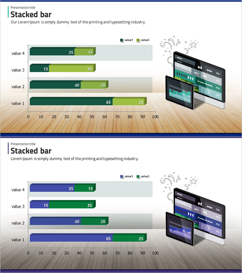
A horizontal bar chart PowerPoint slide designed for mobile services market analysis and competitive benchmarking. This presentation template features two data series—dark green and lime green—displayed side-by-side across four categories, enabling clear numerical comparison. Each bar includes value labels for precise data interpretation during presentations. Ideal for visualizing market share, competitor performance, sales trends, and quantitative metrics in business reports. The slide deck contains 2 slides in 16:9 widescreen format, fully editable in PPTX format for immediate customization.
Usage Points
-
Main Usage
This slide effectively compares quantitative data across multiple categories. With 4 items and 2 data series displayed simultaneously, it's ideal for market share analysis, competitive performance metrics, quarterly sales comparisons, and other scenarios requiring side-by-side numerical evaluation. Clear value labels ensure audiences grasp exact figures instantly.
-
How to Use
Use this slide in business presentations, market analysis reports, and executive briefings within the data comparison section. Simply replace the category labels and numerical values with your own data. The dark green and lime color palette conveys both reliability and growth, making it effective for finance, technology, and marketing presentations.
-
Recommended For
Marketing managers, sales directors, business analysts, management consultants, and market research professionals preparing data-driven decision materials. Particularly valuable for mobile services, IT, financial services, and retail industries where quantitative performance comparison is critical.
-
Slide Structure
Both slides feature identical 4-item horizontal bar chart layouts. Each category displays two bars side-by-side: dark green (value1) and lime green (value2), with numerical labels (15–65) positioned on the bars. The chart uses a 0–100 horizontal axis scale and four category labels on the vertical axis.
Related Products
-

VR Market Analysis Bar Graph – Understanding Competitive Landscape
#Market and Competitor Analysis #Graph #Competitor Analysis
-

Business Partner Analysis Bar Graph – Market Insights
#Market and Competitor Analysis #Graph #Competitor Analysis
-

Horizontal Bar Graph Broken Down by Year – Optimal for Market and Competitor Analysis
#Market and Competitor Analysis #Graph #Competitor Analysis
-

Financial Management Analysis Detailed Graph
#Market and Competitor Analysis #Graph #Competitor Analysis
