Competitor Comparison Paired Bar Graph – A Powerful Tool for Market Analysis
RJ0300009_17
- Last Update 04/20/2025
- File Size 0.1MB
- # of Slides 2
- File Format PPTX
- Slide Ratio 16:9
- Color
Keywords
About the Product
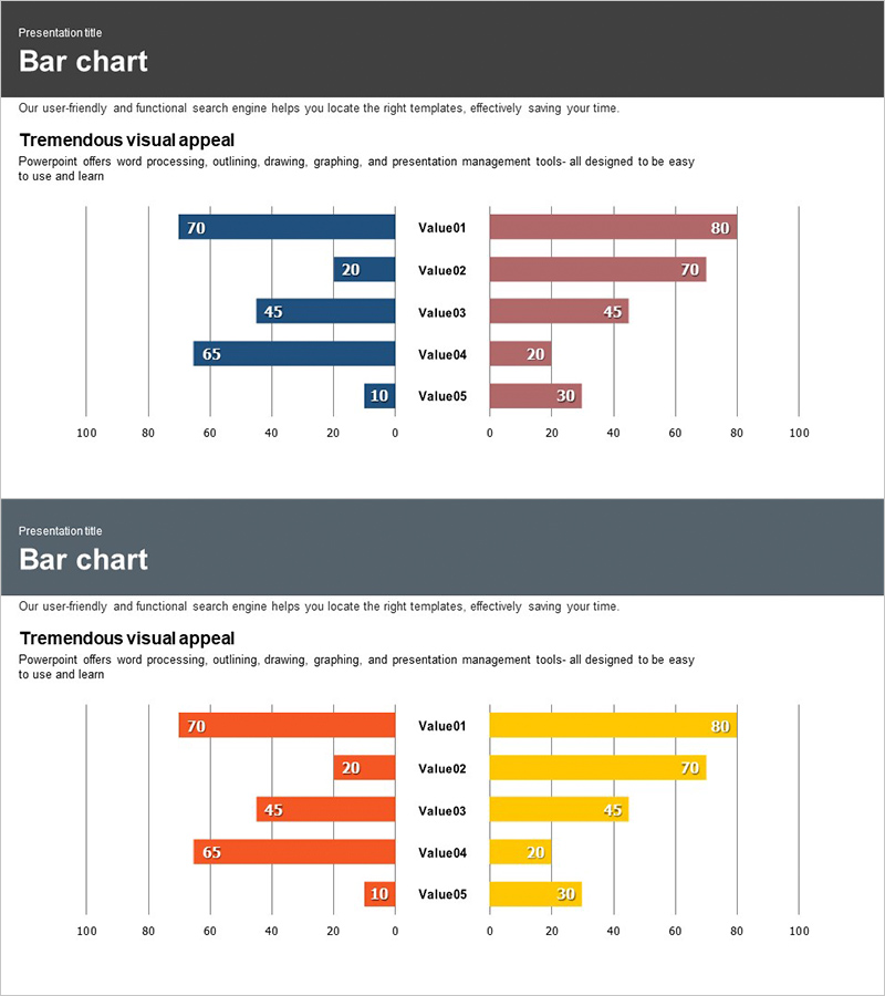
A paired bar chart PowerPoint slide optimized for competitor analysis and market comparison. This presentation template features two data series displayed side-by-side with contrasting colors—navy and wine red on the first slide, orange and yellow on the second—allowing viewers to instantly compare five data points (Value01 through Value05). Each bar displays its numerical value clearly, with a 0–100 horizontal axis scale ideal for ratio comparisons. The two-slide set provides flexible color options to match your presentation theme. Fully editable PPTX format lets you input your own data and use immediately without additional design work.
Usage Points
-
Main Usage
A paired bar chart that displays two data series in left-right contrast, ideal for comparing competitor performance, market share analysis, customer satisfaction metrics, and product feature comparisons. Clear numerical labels ensure accurate data communication in presentations requiring precise quantitative comparison.
-
How to Use
Use in business strategy presentations, market analysis reports, competitive analysis documents, and product comparison decks where simultaneous comparison of two entities is essential. Simply update the bar lengths and values with your actual data; the visual contrast immediately highlights differences between the two items being compared.
-
Recommended For
Marketing professionals, executives, business analysts, consultants, and sales teams presenting competitive positioning, market conditions, and product advantages. Particularly effective in B2B presentations and executive meetings where quantitative comparison is critical to decision-making.
-
Slide Structure
Two-slide set, each featuring a paired bar chart with five items (Value01–Value05). Left bars (70, 20, 45, 65, 10) and right bars (80, 70, 45, 20, 30) are positioned along a 0–100 horizontal axis. Slide 1 uses navy and wine red; Slide 2 uses orange and yellow. Numerical values are labeled on each bar for clarity.
Related Products
-

Horizontal Bar Graph Analysis by Gender – Market Insights
#Market and Competitor Analysis #Graph #Customer Analysis
-

User Analysis Bilinear Bar Graph – Visualizing Customer Insights
#Market and Competitor Analysis #Graph #Customer Analysis
-

Horizontal Bar Chart for Customer Analysis – Highlighting Competitive Advantage
#Market and Competitor Analysis #Graph #Customer Analysis
-

Customer Analysis Double Bar Graph – Effective Market Analysis
#Market and Competitor Analysis #Graph #Customer Analysis
