User Analysis Bilinear Bar Graph – Visualizing Customer Insights
RJ0200019_6
- Last Update 04/02/2025
- File Size 7.2MB
- # of Slides 2
- File Format PPTX
- Slide Ratio 16:9
- Color
Keywords
About the Product
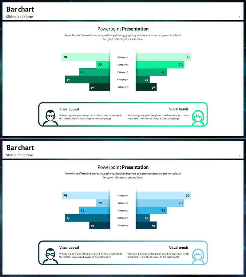
A bilinear bar chart PowerPoint slide designed for visualizing customer insights and user analysis through side-by-side data comparison. This slide presents five categories with contrasting values displayed on the left and right sides, allowing viewers to instantly compare two data groups. Each bar includes numerical labels for precise value communication, with mint-green and dark-green gradient colors distinguishing data layers. The 2-slide set offers alternative color schemes (mint-dark green and light blue-dark blue) to match your presentation tone. Ideal for business reports, market analysis, and competitive benchmarking presentations.
Usage Points
-
Main Usage
This slide compares two data groups side-by-side, making it ideal for customer segment analysis, competitive benchmarking, market research results, and user behavior comparison. The numerical labels on each bar ensure accurate value communication, while color differentiation clarifies data hierarchy. Perfect for presentations requiring comparative analysis across multiple categories.
-
How to Use
Simply replace the five category labels and left-right numerical values with your own data. Bar lengths adjust automatically, and you can maintain the existing design or customize colors and label positions as needed. Both slides share the same structure, so choose your preferred color scheme and apply it throughout your presentation.
-
Recommended For
Marketing analysts, business planners, market researchers, and customer insights teams benefit most from this template. Use it in business plans, marketing strategy presentations, market analysis reports, customer analysis briefings, and executive dashboards to effectively communicate comparative data.
-
Slide Structure
The slide features five bars on the left (70, 20, 45, 65, 30) and five corresponding bars on the right (80, 70, 45, 22, 30) arranged symmetrically around a center dividing line. Each bar displays its numerical value, with mint-green and dark-green gradients on slide 1 and light-blue and dark-blue gradients on slide 2.
Related Products
-

Business Profitability Analysis Graph - Data-Driven Success Strategy
#Market and Competitor Analysis #Graph #Customer Analysis
-

Gender Ratio Analysis Bar Graph – Customer Analysis and Competitive Advantage
#Market and Competitor Analysis #Graph #Customer Analysis
-

Competitor Comparison Paired Bar Graph – A Powerful Tool for Market Analysis
#Market and Competitor Analysis #Graph #Customer Analysis
-

Comparative Analysis Interactive Graph – Market Share Analysis
#Market and Competitor Analysis #Graph #Customer Analysis
