Market Analysis Graph by Year – Visualizing Competitive Advantage
RJ0300009_15
- Last Update 04/20/2025
- File Size 0.1MB
- # of Slides 2
- File Format PPTX
- Slide Ratio 16:9
- Color
Keywords
- #Content-Based Slides
- #Design-Based Slides
- #Market and Competitor Analysis
- #Graph
- #Market Analysis
- #Competitive Advantage
- #Horizontal Bar
- #Grouped Horizontal Bar
- #16:9
- #grouped bar chart PowerPoint
- #horizontal bar graph template
- #year-over-year data comparison slide
- #market analysis chart
- #multi-series bar chart PowerPoint template
About the Product
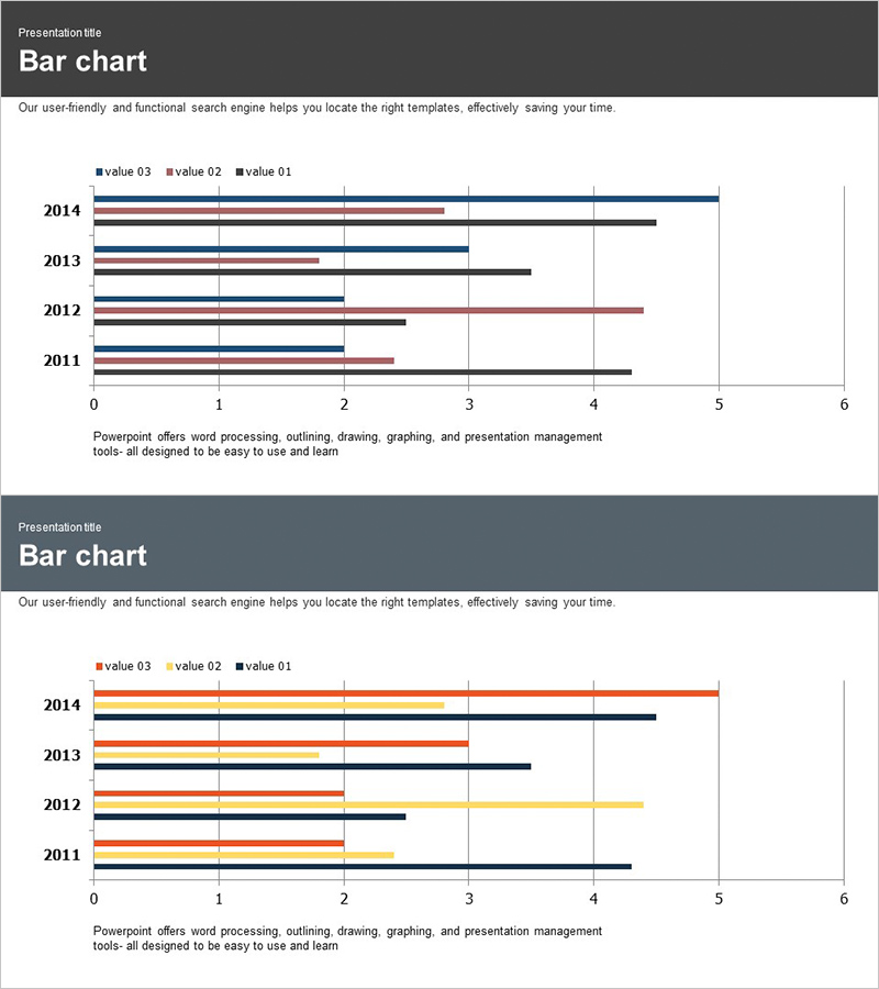
A grouped horizontal bar chart PowerPoint slide designed for year-over-year market analysis and competitive performance tracking. This presentation template displays data from 2011 to 2014 with three data series positioned side-by-side for each year, enabling simultaneous comparison of trends and inter-item performance. The slide uses navy blue, black, and burgundy bars to differentiate each series, with a horizontal axis ranging from 0 to 6 and clear gridlines for easy value reading. Ideal for sales reports, strategic planning presentations, investor pitches, and competitive analysis decks where multi-metric comparison is essential.
Usage Points
-
Main Usage
Enables simultaneous comparison of three metrics across four years, allowing audiences to identify trends over time and performance differences between categories at a glance. Effectively communicates competitive positioning, quarterly growth rates, market share evolution, and other multi-dimensional business metrics.
-
How to Use
Each year row contains three bars arranged left to right, making data entry intuitive and straightforward. Easily modify bar lengths to match your data, adjust colors to fit your brand guidelines, and update legend labels and axis titles to suit various analytical contexts.
-
Recommended For
Marketing professionals presenting market analysis, sales teams reporting quarterly performance, executives in strategic planning meetings, investor presentations, consulting firms delivering client analysis, and business analysts comparing multi-year trends.
-
Slide Structure
Two-slide set featuring a primary version with navy, black, and burgundy bars, and an alternate color version with orange, yellow, and black bars. Both slides contain four year rows (2011–2014), a horizontal axis from 0 to 6, and prominent gridlines for precise value identification.
Related Products
-

Audio Icons and Comparison Graphs – A New Dimension in Market Analysis
#Market and Competitor Analysis #Graph #Market Analysis
-

Travel Guide Market Analysis by State in the United States Using Horizontal Bar Chart
#Market and Competitor Analysis #Graph #Other
-

Horizontal Bar Chart for Construction Project Performance Analysis – Stability and Growth
#Market and Competitor Analysis #Diagram #Graph
-

Visualizing Market Status with Horizontal Bar Chart – Emphasizing Competitive Edge
#Market and Competitor Analysis #Graph #Market Status
