Eco Market Analysis Graph – Visualizing Competitive Advantage Data
RJ0300003_9
- Last Update 04/20/2025
- File Size 1.4MB
- # of Slides 2
- File Format PPTX
- Slide Ratio 16:9
- Color
Keywords
- #Content-Based Slides
- #Design-Based Slides
- #Market and Competitor Analysis
- #Graph
- #Market Status
- #Competitive Advantage
- #Horizontal Bar
- #Horizontal Bar Chart
- #16:9
- #horizontal bar chart PowerPoint
- #bar graph presentation slide
- #data comparison chart
- #market analysis graph
- #competitive advantage visualization
- #6-item comparison slide
About the Product
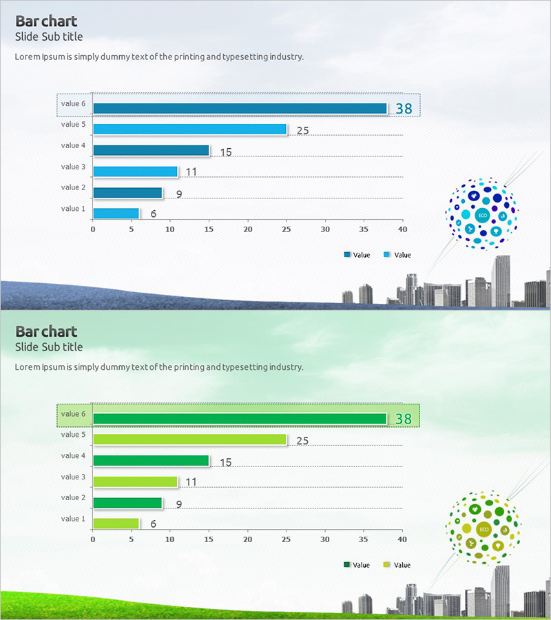
A horizontal bar chart PowerPoint slide optimized for market analysis and competitive advantage comparison. The design uses blue and green dual-tone colors to clearly distinguish two data series, with six items arranged horizontally for intuitive comparative visualization. Numerical labels appear at the end of each bar for precise data communication, while a city skyline illustration and circular icon elements enhance the visual polish of your presentation. Composed of 2 slides in 16:9 widescreen format, ready for immediate editing and deployment.
Usage Points
-
Main Usage
Ideal for market analysis reports, competitor benchmarking, sales performance comparison, customer satisfaction survey results, and other scenarios requiring six or more numerical data points in horizontal ranking format. The blue and green dual-tone color scheme effectively communicates two data series simultaneously for contrastive analysis.
-
How to Use
Bar length and color instantly convey numerical magnitude and category. Numerical labels in the upper right corner of each slide provide precise values, while the city skyline and circular icon elements reinforce professional business presentation standards. Edit data directly in PowerPoint to automatically update the chart visualization.
-
Recommended For
Marketing managers, sales directors, executives, consultants, data analysts, and business planning teams presenting market status analysis, competitive benchmarking, performance reports, and strategic planning. Particularly suited for business presentations requiring quantitative comparative analysis and data-driven decision-making.
-
Slide Structure
Two-slide composition, each containing a horizontal bar chart with six data items. The first slide displays single-series blue data; the second presents dual-series blue and green data. Formatted in 16:9 widescreen for optimal compatibility with modern projectors and displays.
Related Products
-

Meat and Vegetable Consumption by Region – Market Status Analysis
#Market and Competitor Analysis #Graph #Other
-

Market Analysis Visualization with Horizontal Bar Chart – Emphasizing Competitive Advantage
#Market and Competitor Analysis #Graph #Market Status
-

Test Tube Bar Graph for Market Analysis – Highlighting Competitive Advantage
#Market and Competitor Analysis #Graph #Market Status
-

India Travel-Related Business Overview and Market Share – Market Status Analysis
#Market and Competitor Analysis #Graph #Market Status
