Key Performance Analysis Bar Graph – Visualization of KPIs
RJ0300002_5
- Last Update 04/19/2025
- File Size 14.2MB
- # of Slides 2
- File Format PPTX
- Slide Ratio 16:9
- Color
Keywords
- #Content-Based Slides
- #Design-Based Slides
- #Company Introduction
- #Market and Competitor Analysis
- #Graph
- #Key Achievements
- #Competitive Advantage
- #Horizontal Bar
- #Horizontal Bar Chart
- #16:9
- #horizontal bar chart PowerPoint
- #KPI analysis slide template
- #performance metrics PowerPoint
- #bar graph presentation slide
- #data comparison PowerPoint template
About the Product
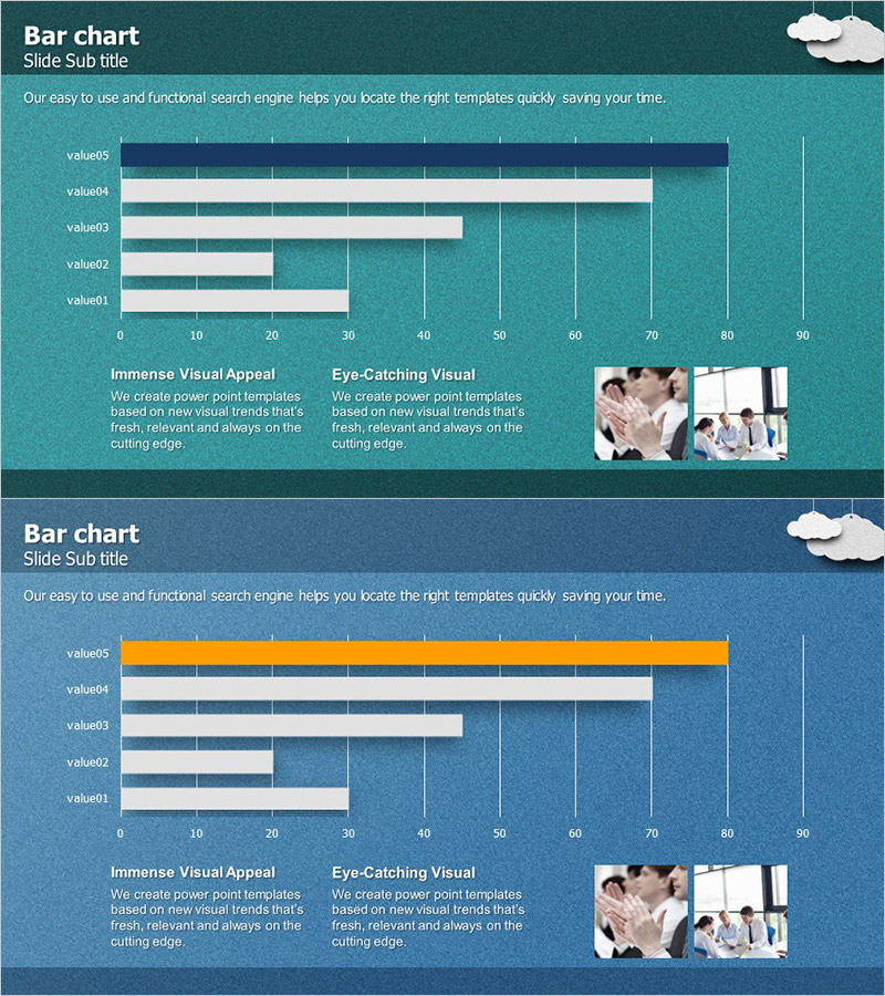
A PowerPoint slide template featuring five data items displayed as horizontal bars for easy comparison. The design uses navy blue, mint green, and orange accent colors to highlight key performance indicators (KPIs), with a 0–90 scale and gridlines for precise data reading. Ideal for business presentations, executive reports, and performance analysis decks, this slide includes descriptive text areas and image placeholders for immediate customization and professional delivery.
Usage Points
-
Main Usage
Enable executives, managers, and team leads to compare and analyze key performance indicators (KPIs) at a glance, supporting data-driven decision-making. Visualize five critical metrics—such as sales volume, customer satisfaction, market share, cost reduction, and productivity—using bar length for intuitive understanding in performance reviews and strategic planning meetings.
-
How to Use
Replace the slide title 'Bar chart' and subtitle 'Slide Sub title' with your presentation topic. Update the value01–value05 labels to match your actual KPI names and adjust each bar length to reflect corresponding data values. Add analysis insights and supporting images to the text and image areas at the bottom to complete the slide.
-
Recommended For
Executives, CFOs, business unit heads, marketing managers, and project managers presenting quarterly or annual performance reports, competitive benchmarking analyses, departmental KPI updates, and investor presentations. Particularly effective for emphasizing quantitative data in executive briefings and strategic planning sessions.
-
Slide Structure
Both slides follow identical layout: title section at top, five-item horizontal bar chart in center (0–90 scale with gridlines), two descriptive text blocks at bottom left ('Immense Visual Appeal' and 'Eye-Catching Visual'), and image placeholder area at bottom right (two business photos). Slide 2 features an orange-highlighted bar to emphasize a specific metric.
Related Products
-

Achievement Status Bar Graph – Key Performance and Competitive Advantage
#Company Introduction #Market and Competitor Analysis #Graph
-

Company Key Performance Charts – Importance and Success
#Company Introduction #Business Introduction #Graph
-

Horizontal Bar Chart for Competitive Advantage Analysis – Sea Lighthouse
#Market and Competitor Analysis #Diagram #Graph
-

Highlight Graph and Analytical Text – Emphasizing Results and Competitive Advantage
#Company Introduction #Market and Competitor Analysis #Graph
