Business Expectations & Graphs – Visualizing Growth in Presentations
RJ0300002_12
- Last Update 04/19/2025
- File Size 14.3MB
- # of Slides 2
- File Format PPTX
- Slide Ratio 16:9
- Color
Keywords
- #Content-Based Slides
- #Design-Based Slides
- #Product/Service Introduction
- #Business Strategy
- #Graph
- #Development Status
- #Financial Outlook & Expected Impact
- #Column
- #Grouped Column
- #16:9
- #grouped column chart PowerPoint
- #dual-series data comparison slide
- #business metrics visualization
- #PowerPoint chart template download
- #how to create grouped bar chart in PowerPoint
About the Product
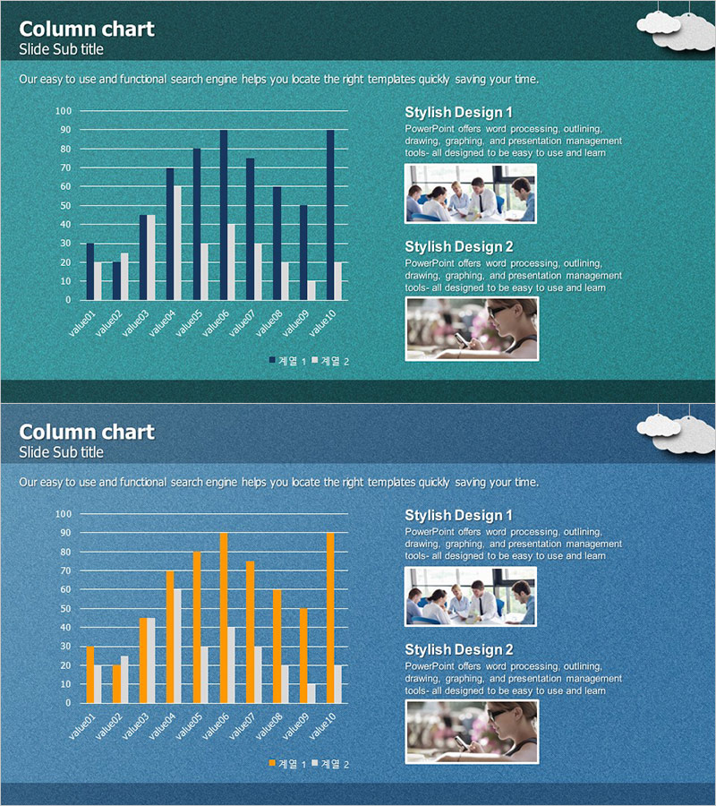
A grouped column chart PowerPoint slide designed to visualize business growth and performance metrics with dual-series data comparison. The slide features teal and orange color schemes that create strong visual contrast, allowing you to compare two data sets across 12 items simultaneously. Horizontal gridlines enhance readability of numerical values, making it ideal for business reports, quarterly presentations, and performance dashboards. The 2-slide set includes variations with different color themes, enabling seamless integration across multiple sections of your presentation or report.
Usage Points
-
Main Usage
Ideal for comparing two related metrics across multiple categories—such as sales by region, budget vs. actual spending, year-over-year performance, or competitive benchmarking. The grouped format allows stakeholders to instantly identify trends and performance gaps between the two data series.
-
How to Use
Replace the 12 item labels on the horizontal axis with your own categories (months, regions, products, etc.). Adjust the teal and orange column heights to match your data values. Update the legend labels to reflect your two data series. Insert into quarterly reports, board presentations, or strategic planning documents.
-
Recommended For
Sales managers, financial analysts, business intelligence professionals, marketing strategists, and operations teams presenting performance metrics. Suitable for quarterly business reviews, annual reports, competitive analysis presentations, and budget variance reports.
-
Slide Structure
2-slide set featuring grouped column charts with 12 categories on the x-axis and a 0–100 scale on the y-axis. Each category displays two columns (teal and orange) side-by-side for direct comparison. Includes title area, legend, and gridlines for easy value reading.
Related Products
-

Modern Business Plan Presentation Template Bubble Diagram – Efficient Planning Visualization
#Business Strategy #Diagram #Graph
-

Simple Circle Presentation Template for Column Chart – Clearly Demonstrating Business Performance
#Business Strategy #Graph #Financial Outlook & Expected Impact
-

Profit Forecast and Progress Graph – Harmony of Blue and Orange
#Business Strategy #Graph #Financial Outlook & Expected Impact
-

Progress and Profit Outlook Graph – Harmony of Green and Orange
#Business Strategy #Graph #Financial Outlook & Expected Impact
