Curved Theme Purple Template Line Chart – Visualize Business Strategy
RJ0200068_23
- Last Update 04/18/2025
- File Size 1.3MB
- # of Slides 2
- File Format PPTX
- Slide Ratio 16:9
- Color
Keywords
About the Product
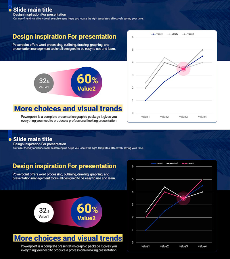
A multi-series line chart PowerPoint slide designed to visualize business progress and market trends with three data series. The slide features a purple-to-pink gradient background with four data points connected across three trend lines in blue, pink, and red. Circular markers at each intersection point and horizontal gridlines enhance data readability and precise value identification. This presentation slide is ready to use in business reports, strategy analyses, and quarterly performance reviews. Provided as a 2-slide set in 16:9 widescreen format with fully editable chart elements.
Usage Points
-
Main Usage
Ideal for comparing multiple data series over time, such as business progress, market trends, and sales performance. The three simultaneous trend lines enable quick identification of correlations and pattern changes, making it perfect for quarterly or annual performance comparisons and strategic analysis presentations.
-
How to Use
The chart is fully editable—simply input your data values and the graph updates automatically. Replace the legend labels (value1, value2, value3) with your actual metric names, modify data points, and customize background colors, line colors, and marker styles as needed. No design skills required for quick deployment.
-
Recommended For
Recommended for executives, planning teams, marketing departments, and sales teams presenting quarterly or annual performance reviews. Particularly useful when comparing multiple KPIs, market share evolution, customer satisfaction trends, or any scenario requiring simultaneous multi-metric analysis.
-
Slide Structure
Title area at top with chart area below. The line chart displays 4 data points on the X-axis (value1 to value4), Y-axis range 0–6, and 3 data series in blue, pink, and red lines. Circular markers highlight each intersection point. A legend in the upper right and horizontal gridlines ensure clear data interpretation.
Related Products
-

Competitor Analysis Graph for Market Capture
#Market and Competitor Analysis #Graph #Competitor Analysis
-

Trend Visualization of Surgery for Market and Competitive Analysis
#Market and Competitor Analysis #Graph #Market Analysis
-

Data Analysis Graph Visualization for Market Competition
#Market and Competitor Analysis #Diagram #Graph
-

Medical Experimental Research Data Analysis Slide – Market and Competitor Analysis
#Market and Competitor Analysis #Graph #Competitor Analysis
