Premium Management Presentation Line Chart – Business Strategy and Revenue Forecast
RJ0200031_12
- Last Update 04/06/2025
- File Size 8.2MB
- # of Slides 2
- File Format PPTX
- Slide Ratio 16:9
- Color
Keywords
- #Content-Based Slides
- #Design-Based Slides
- #Business Strategy
- #Graph
- #Financial Outlook & Expected Impact
- #Line
- #Line Chart
- #Project Progress
- #16:9
- #line chart PowerPoint slide
- #multi-series trend comparison
- #business progress chart template
- #revenue forecast graph
- #how to create line chart in PowerPoint
About the Product
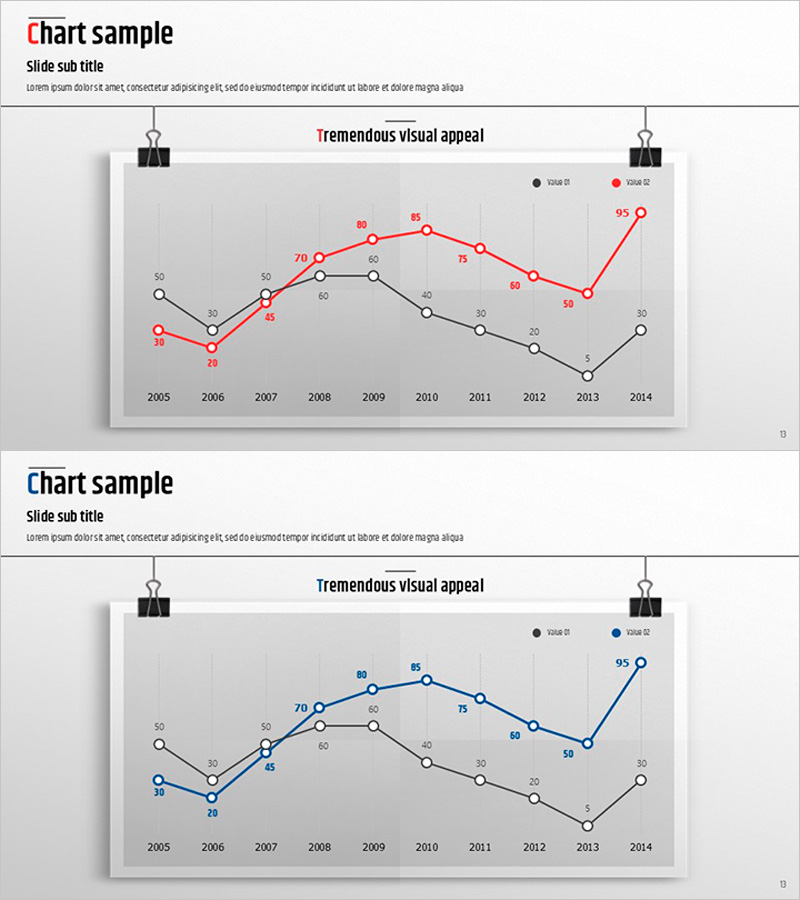
A professional line chart PowerPoint slide designed to visualize business progress and revenue forecasts over time. This presentation template displays 10 years of data (2005–2014) across three distinct series in black, red, and blue lines on a neutral gray background. Each data point is labeled with precise numerical values for clear information delivery, and decorative clip-pin icons anchor the slide design. The two-slide set is ready to use in executive reports, quarterly business reviews, investor presentations, and strategic planning sessions where multi-series trend analysis is essential.
Usage Points
-
Main Usage
Effectively compare long-term business metrics and display multiple data series simultaneously to identify trends and patterns. Ideal for presenting annual performance, revenue forecasts, cost analysis, and competitive benchmarking in executive dashboards and investor communications.
-
How to Use
Double-click the chart to enter edit mode and modify data values directly; the graph updates automatically. Change line colors to match your corporate branding, edit the legend labels, adjust axis ranges, or add additional years and data series as needed. All elements are fully editable in PowerPoint.
-
Recommended For
Executives, business analysts, financial managers, and marketing teams presenting quarterly or annual performance metrics. Particularly effective for comparing revenue vs. costs, profit trends, market share growth, or competitive analysis. Suitable for board meetings, investor relations materials, and strategic business proposals.
-
Slide Structure
Two-slide set, each with a title and subtitle area above a full-width line chart. The chart features an X-axis (years 2005–2014), Y-axis (0–95 scale), three distinct data series with labeled points, and a legend. Decorative clip-pin icons at the top of each slide provide visual consistency and professional polish.
Related Products
-

Highlighting Line Graphs in Volume Presentation Template
#Business Strategy #Graph #Financial Outlook & Expected Impact
-

Mid-to-Long Term Vision & Growth Strategy Roadmap – Business Advancement Timeline
#Business Strategy #Diagram #Graph
-

Visualizing Project Progress and Future Prospects – Journey to Success
#Business Strategy #Market and Competitor Analysis #Graph
-

Estimated Sales Revenue Graph – Visualizing Business Performance
#Business Strategy #Financial Plans and Performance #Graph
