Square Frame Presentation Template for Line Chart – Market and Competitive Analysis
RJ0200010_9
- Last Update 09/30/2025
- File Size 0.5MB
- # of Slides 2
- File Format PPTX
- Slide Ratio 16:9
- Color
Keywords
- #Content-Based Slides
- #Design-Based Slides
- #Business Strategy
- #Market and Competitor Analysis
- #Graph
- #Competitive Advantage
- #Line
- #Line Chart
- #Project Progress
- #16:9
- #line chart PowerPoint slide
- #multi-series trend analysis
- #market comparison chart
- #competitive analysis graph
- #line graph template download
- #how to create line chart in PowerPoint
About the Product
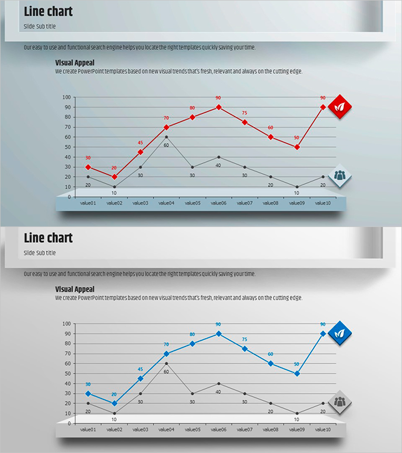
A multi-series line chart PowerPoint slide designed to compare market trends and competitive performance simultaneously. The slide features three data series (red, blue, and black lines) tracking ten data points across a gray gridded background, clearly visualizing change patterns and performance trajectories. All data values are fully editable, allowing you to input actual market data or competitive analysis results directly into the presentation. This slide template is optimized for business progress reports, market analysis sections, and competitive landscape presentations where quantitative evidence is essential.
Usage Points
-
Main Usage
Visualize numerical changes and trends over time in market analysis, competitive benchmarking, and business progress reporting. Effectively compare multiple performance indicators simultaneously and communicate relative position shifts and trajectory changes to stakeholders.
-
How to Use
Input actual data values into each series (value01 through value10) and the line chart automatically updates. Customize colors and series labels to match your analysis categories, then insert directly into presentations or reports. All elements remain fully editable for further refinement.
-
Recommended For
Executive reports, business plans, marketing strategy presentations, investor pitch decks, quarterly and annual performance reviews. Ideal for finance professionals, marketing managers, strategic planners, and sales directors presenting quantitative performance data and market insights.
-
Slide Structure
Two-slide set. First slide displays all three data series (red, blue, black lines) for comprehensive comparison. Second slide emphasizes the blue series for focused analysis. Both slides include Y-axis range 0–100, X-axis with 10 data points, gridlines, legend, and icon indicators.
Related Products
-

Five Color Wide Template – Horizontal Line Graph for Business Strategy
#Business Strategy #Market and Competitor Analysis #Graph
-

Triangular Pattern Presentation Template – Business Strategy & Market Analysis
#Business Strategy #Market and Competitor Analysis #Graph
-

Learning Goal Deflection Line Graph – Business Strategy
#Business Strategy #Market and Competitor Analysis #Graph
-

Social Network Wide Template Line Chart - Market Competition Analysis
#Business Strategy #Market and Competitor Analysis #Graph
