Simple PPT Wide Template Vertical Bar Chart
RJ0200065_25
- Last Update 04/17/2025
- File Size 0.4MB
- # of Slides 2
- File Format PPTX
- Slide Ratio 16:9
- Color
Keywords
- #Content-Based Slides
- #Design-Based Slides
- #Business Strategy
- #Financial Plans and Performance
- #Graph
- #Financial Outlook & Expected Impact
- #Sales and Revenue
- #Column
- #Grouped Column
- #16:9
- #vertical bar chart PowerPoint
- #dual-series chart slide
- #data comparison template
- #financial data visualization
- #bar graph presentation slide
About the Product
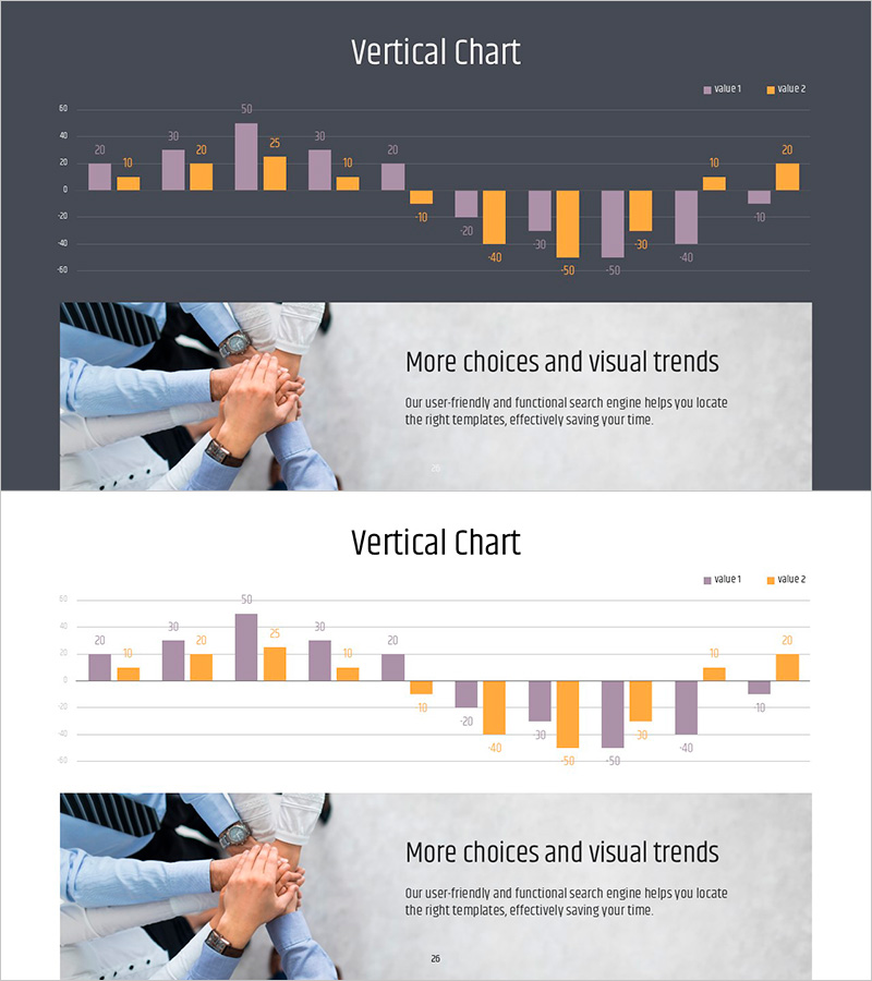
A vertical bar chart PowerPoint slide template for comparing two data series side by side. Features a dark gray background with pink and orange bar colors that create clear visual contrast for numerical comparisons. The 16:9 widescreen format includes 2 slides ready for financial reports, revenue forecasts, business performance, and sales metrics presentations. Data values are labeled above each bar for precise audience comprehension. Fully editable PPTX format allows you to customize colors, data values, axis labels, and legend text to match your presentation context.
Usage Points
-
Main Usage
Visualize and compare two data series—such as financial metrics, revenue trends, business performance, or sales figures—using side-by-side vertical bars. The labeled values above each bar ensure precise data communication, while the pink and orange color scheme makes the two series instantly distinguishable.
-
How to Use
Deploy in executive briefings, investor presentations, quarterly performance reviews, and marketing status updates where quantitative data comparison is essential. Modify bar values, axis labels, and legend text to reflect your specific dataset. The dual-series structure supports year-over-year comparisons, regional performance analysis, or budget-versus-actual scenarios.
-
Recommended For
Finance teams, executives, marketing managers, sales leaders, and project managers presenting data-driven insights. Perfect for quarterly earnings reports, regional sales comparisons, product performance analysis, and budget variance presentations where two-category comparison is the focus.
-
Slide Structure
Slide 1: Dark gray background with title area and vertical bar chart. Approximately 10 data points on X-axis, two series (Value 1 and Value 2) on Y-axis with labeled values above each bar. Slide 2: Identical chart structure for additional datasets. Legend positioned in upper right corner identifying both data series.
Related Products
-

Visualizing Product Sales Performance and Future Outlook with Horizontal Bar Chart
#Business Strategy #Financial Plans and Performance #Graph
-

(Orange & Green) Bundle Chart and Future Outlook
#Business Strategy #Financial Plans and Performance #Graph
-

Triangle Pattern Column Chart Presentation Template
#Market and Competitor Analysis #Financial Plans and Performance #Diagram
-

Leather Material Map Template - Global Network Visualization
#Company Introduction #Financial Plans and Performance #Graph
