(Orange & Green) Bundle Chart and Future Outlook
RB0800047_6
- Last Update 03/26/2025
- File Size 0.3MB
- # of Slides 2
- File Format PPTX
- Slide Ratio 4:3
- Color
Keywords
- #Content-Based Slides
- #Design-Based Slides
- #Business Strategy
- #Financial Plans and Performance
- #Graph
- #Financial Outlook & Expected Impact
- #Sales and Revenue
- #Column
- #Grouped Column
- #4:3
- #grouped bar chart PowerPoint
- #data comparison slide template
- #4-series chart
- #sales analysis presentation
- #business data visualization slide
About the Product
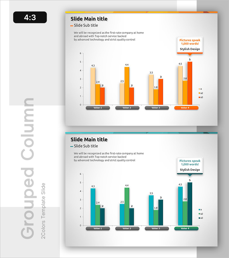
A grouped bar chart PowerPoint slide designed to compare four data series side by side. The first slide features warm tones (orange, yellow, red), while the second slide uses cool tones (cyan, green, dark blue), allowing you to match your presentation style and corporate branding. Each value (4.3, 2.4, 2, etc.) is clearly labeled, making it ideal for quarterly sales analysis, departmental performance comparison, product sales breakdown, and competitive benchmarking. The 2-slide set provides flexibility in color selection while maintaining consistent data visualization structure across your presentation.
Usage Points
-
Main Usage
Visualize and compare four data series simultaneously, such as quarterly revenue trends, departmental performance metrics, product sales figures, or competitive analysis. The grouped bar layout enables audiences to quickly identify differences and patterns across multiple categories while maintaining clear numerical values for each bar.
-
How to Use
Replace the Value 1–4 labels and bar heights with your actual data. Slide 1 with warm tones (orange, yellow, red) conveys optimism and growth, while Slide 2 with cool tones (cyan, green, dark blue) projects stability and trust. Select the version that best matches your corporate colors and presentation tone, then customize the legend labels (a1, a2, a3) to reflect your data categories.
-
Recommended For
Quarterly earnings reports, departmental performance reviews, marketing campaign results, business plan sections comparing targets versus actuals, investor pitch decks highlighting growth metrics, and executive dashboards requiring multi-category comparisons. Ideal for presentations where stakeholders need to evaluate performance across regions, product lines, or business units simultaneously.
-
Slide Structure
Each slide contains a title and subtitle area, descriptive text, a grouped bar chart with 4 value groups (Value 1–4), and a legend (a1, a2, a3). Three bars are grouped together for each value, with numerical labels displayed above each bar. The 4:3 aspect ratio ensures compatibility with standard projectors and display screens, making it suitable for both in-person and virtual presentations.
Related Products
-

Visualizing Product Sales Performance and Future Outlook with Horizontal Bar Chart
#Business Strategy #Financial Plans and Performance #Graph
-

Simple PPT Wide Template Vertical Bar Chart
#Business Strategy #Financial Plans and Performance #Graph
-

Triangle Pattern Column Chart Presentation Template
#Market and Competitor Analysis #Financial Plans and Performance #Diagram
-

Leather Material Map Template - Global Network Visualization
#Company Introduction #Financial Plans and Performance #Graph
