Performers and Bundled Charts – Sales and Revenue Analysis
RJ0500020_14
- Last Update 06/12/2025
- File Size 0.5MB
- # of Slides 2
- File Format PPTX
- Slide Ratio 16:9
- Color
Keywords
- #Content-Based Slides
- #Design-Based Slides
- #Market and Competitor Analysis
- #Financial Plans and Performance
- #Graph
- #Market Analysis
- #Sales and Revenue
- #Column
- #Grouped Column
- #16:9
- #grouped column chart PowerPoint
- #vertical bar chart template
- #sales revenue comparison slide
- #2-series chart PowerPoint
- #financial analysis graph
- #how to create grouped chart in PowerPoint
About the Product
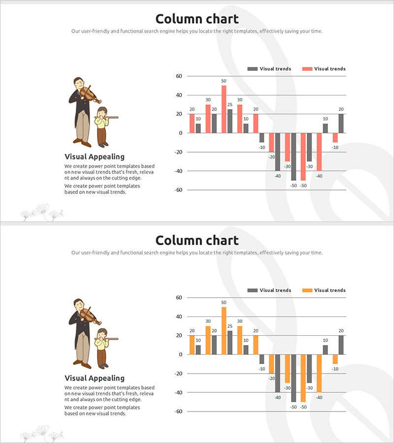
A grouped column chart PowerPoint slide designed to compare sales and revenue data simultaneously. The vertical bar chart features two data series in gray and orange, enabling clear side-by-side comparison across multiple periods or categories. An illustrated character on the left side adds visual appeal to your presentation. This 2-slide template is ready to use for financial analysis, business performance reports, marketing data visualization, and executive briefings. All values are fully editable to match your specific dataset.
Usage Points
-
Main Usage
Designed to compare two related metrics side-by-side, such as revenue versus profit, budget versus actual, or year-over-year performance. The grouped column format makes it easy to show correlations and differences between data series at a glance, ideal for financial analysis and business intelligence presentations.
-
How to Use
Double-click any value on the chart to edit numbers directly; bar heights adjust automatically. Modify legend colors and axis labels to match your data. The character illustration on the left can be deleted or replaced with your own image. All elements are fully customizable within PowerPoint.
-
Recommended For
Finance teams presenting quarterly or annual results, marketing teams analyzing channel performance, executives briefing on business status, and investor presentations on profitability. Particularly effective for board meetings, shareholder reports, and C-suite presentations requiring dual-metric analysis.
-
Slide Structure
2-slide template featuring vertical grouped column charts with gray and orange data series. Each chart displays approximately 10 data points and supports both positive and negative values. Optimized for 16:9 widescreen format with clear gridlines and legend positioning for maximum readability.
Related Products
-

Revenue Vertical Bar Chart – Innovation in Market Analysis
#Market and Competitor Analysis #Financial Plans and Performance #Graph
-

Animal Nature Conservation Program Facility Investment Plan Chart
#Market and Competitor Analysis #Financial Plans and Performance #Graph
-

Simple Car Wide Presentation Vertical Bar Chart
#Market and Competitor Analysis #Financial Plans and Performance #Graph
-

Visual Comparison by Product Group Slide Template – Market Trends and Performance
#Market and Competitor Analysis #Financial Plans and Performance #Graph
