Analyze Sales Performance with Geometric Pattern Wide Bar Chart
RJ0200061_15
- Last Update 04/16/2025
- File Size 1MB
- # of Slides 2
- File Format PPTX
- Slide Ratio 16:9
- Color
Keywords
- #Content-Based Slides
- #Design-Based Slides
- #Market and Competitor Analysis
- #Financial Plans and Performance
- #Graph
- #Competitive Advantage
- #Sales and Revenue
- #Column
- #Grouped Column
- #16:9
- #clustered bar chart PowerPoint
- #dual-series data comparison slide
- #bar graph presentation template
- #sales analysis PowerPoint slide
- #financial data visualization
About the Product
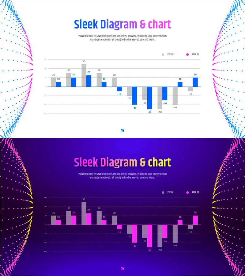
A PowerPoint slide featuring a clustered bar chart with geometric pattern background, displaying two data series in contrasting blue and magenta colors. This presentation template includes two versions: a light background slide and a dark purple background slide, both in 16:9 widescreen format. The chart structure supports both positive and negative values, making it ideal for sales performance analysis, market comparison, financial planning, and competitive benchmarking. Fully editable text and data fields allow quick customization for quarterly reports, investor presentations, and business performance reviews.
Usage Points
-
Main Usage
This slide visualizes two data series side-by-side using a clustered bar chart format, enabling direct comparison of metrics across categories. Ideal for sales performance comparison, market share analysis, departmental performance benchmarking, year-over-year trends, and profit-loss analysis. The dual-axis structure accommodates both positive and negative values for comprehensive financial reporting.
-
How to Use
Deploy this slide in the financial analysis or performance review section of your presentation. The geometric pattern background draws visual attention, making it effective for highlighting critical data points. Use the light background version for daytime presentations and bright venues; select the dark purple version for evening presentations or projector-based environments with reduced ambient light.
-
Recommended For
Finance teams, marketing departments, and sales divisions presenting quarterly reports, performance reviews, investor relations meetings, and strategic business plans. Particularly effective when comparing two departments, product lines, or market segments simultaneously. Recommended for executive briefings, board presentations, and data-driven decision-making contexts.
-
Slide Structure
Standard clustered bar chart with horizontal axis (categories) and vertical axis (numerical values). Two data series are grouped side-by-side for each category, with precise numerical labels displayed above each bar. The chart accommodates both positive (upper) and negative (lower) value ranges, enabling clear representation of gains, losses, and comparative metrics.
Related Products
-

Visualizing Sales Performance with Column Chart – Presentation for Competitive Advantage
#Market and Competitor Analysis #Financial Plans and Performance #Graph
-

Analysis of Bakery and Seafood Market Trends with Bar and Column Charts
#Market and Competitor Analysis #Financial Plans and Performance #Graph
-

Carbon Neutral Sales and Profit Chart – Sustainable Management
#Market and Competitor Analysis #Financial Plans and Performance #Graph
-

Graph of Increase/Decrease in Meat Consumption – Market Analysis and Competitive Advantage
#Market and Competitor Analysis #Financial Plans and Performance #Graph
