Analysis of Bakery and Seafood Market Trends with Bar and Column Charts
RJ0800051_16
- Last Update 08/14/2025
- File Size 0.2MB
- # of Slides 2
- File Format PPTX
- Slide Ratio 16:9
- Color
Keywords
- #Content-Based Slides
- #Design-Based Slides
- #Market and Competitor Analysis
- #Financial Plans and Performance
- #Graph
- #Competitive Advantage
- #Sales and Revenue
- #Column
- #Grouped Column
- #16:9
- #grouped bar chart PowerPoint
- #column chart slide template
- #2-series comparison slide
- #market trend analysis PPT
- #how to create grouped bar chart in PowerPoint
About the Product
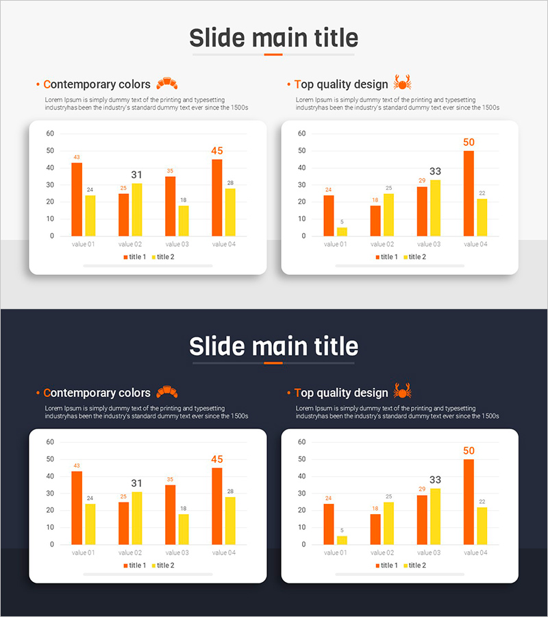
A grouped bar chart PowerPoint slide visualizing bakery and seafood market trends with two data series in orange and yellow. This 2-slide template features vertical bar charts comparing four values (value 01 through value 04) side by side, with title, descriptive text, and icon elements on each slide. Both light and dark background versions are included for flexible presentation contexts. The 16:9 widescreen PPTX format allows immediate editing and customization for market analysis, sales comparison, and revenue trend presentations.
Usage Points
-
Main Usage
Clearly visualizes market trends, sales figures, and revenue comparisons using grouped bar charts with two data series. Optimized for food industry market analysis, quarterly and annual sales comparisons, and product line revenue trend presentations.
-
How to Use
Replace the sample values (43, 24, 31, 28, etc.) with your actual data for immediate use. The light background version suits general presentations and reports, while the dark background version works well for executive briefings and premium presentations.
-
Recommended For
Marketing teams presenting market analysis, sales teams reporting performance metrics, executives reviewing quarterly results, consulting firms conducting industry analysis, and food and retail companies presenting business plans.
-
Slide Structure
2-slide set. Each slide contains a title area, two legend entries (title 1 and title 2), vertical bar chart with 4 items (value 01–04), descriptive text, and icon. Orange and yellow data series are positioned side by side for intuitive item-by-item comparison.
Related Products
-

Graph of Increase/Decrease in Meat Consumption – Market Analysis and Competitive Advantage
#Market and Competitor Analysis #Financial Plans and Performance #Graph
-

Carbon Neutral Sales and Profit Chart – Sustainable Management
#Market and Competitor Analysis #Financial Plans and Performance #Graph
-

Analyze Sales Performance with Geometric Pattern Wide Bar Chart
#Market and Competitor Analysis #Financial Plans and Performance #Graph
-

Visualizing Sales Performance with Column Chart – Presentation for Competitive Advantage
#Market and Competitor Analysis #Financial Plans and Performance #Graph
