Graph of Increase/Decrease in Meat Consumption – Market Analysis and Competitive Advantage
RJ0600041_8
- Last Update 07/02/2025
- File Size 0.2MB
- # of Slides 2
- File Format PPTX
- Slide Ratio 16:9
- Color
Keywords
- #Content-Based Slides
- #Design-Based Slides
- #Market and Competitor Analysis
- #Financial Plans and Performance
- #Graph
- #Competitive Advantage
- #Sales and Revenue
- #Column
- #Grouped Column
- #16:9
- #grouped column chart PowerPoint
- #vertical bar graph presentation
- #data comparison slide
- #market analysis chart
- #consumption trend visualization
- #how to create grouped column chart in PowerPoint
About the Product
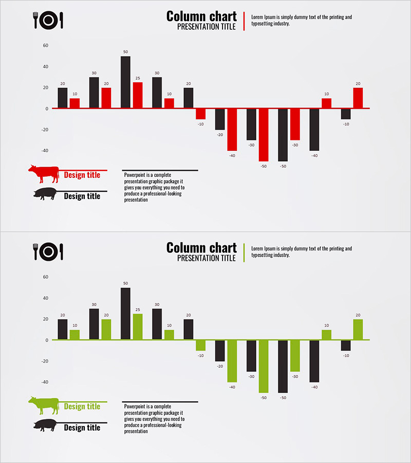
A grouped column chart PowerPoint slide set featuring meat consumption increase and decrease data across 2 series. Red and black columns are positioned side-by-side to highlight contrasting data, making market analysis and competitive advantage immediately clear. Numeric labels appear above each bar for precise data representation. This 2-slide deck in 16:9 widescreen PPTX format is ready for business presentations including market reports, marketing plans, and competitive analysis. Colors and data values are fully editable, allowing seamless integration into industry-specific reports, sales presentations, and strategic planning documents.
Usage Points
-
Main Usage
Visualize two-series numerical data side-by-side to emphasize differences in consumption trends, market share, or competitor sales volumes. The chart accommodates both positive and negative values, making it ideal for increase/decrease analysis in market reports, business performance reviews, and strategic marketing presentations.
-
How to Use
Replace the numeric labels above each bar with your own data values and update the legend series names to match your categories. Adjust the color scheme from red and black to suit your brand or data meaning (e.g., positive/negative, us/competitor), and modify axis ranges and intervals to fit your dataset.
-
Recommended For
Marketing managers, business analysts, sales directors, financial planners, and consultants presenting market conditions, consumption patterns, sales performance comparisons, and competitive analysis. Suitable for quarterly reports, market analysis sections in business plans, competitive intelligence presentations, and industry benchmarking documents.
-
Slide Structure
2-slide deck with grouped column charts featuring X-axis (categories) and Y-axis (numeric values). Each slide displays two data series (red and black columns) positioned side-by-side for each category, accommodating both positive and negative values. Includes numeric labels, legend, and title areas for immediate customization and presentation use.
Related Products
-

Analysis of Bakery and Seafood Market Trends with Bar and Column Charts
#Market and Competitor Analysis #Financial Plans and Performance #Graph
-

Carbon Neutral Sales and Profit Chart – Sustainable Management
#Market and Competitor Analysis #Financial Plans and Performance #Graph
-

Analyze Sales Performance with Geometric Pattern Wide Bar Chart
#Market and Competitor Analysis #Financial Plans and Performance #Graph
-

Visualizing Sales Performance with Column Chart – Presentation for Competitive Advantage
#Market and Competitor Analysis #Financial Plans and Performance #Graph
