Visualizing Sales Performance with Column Chart – Presentation for Competitive Advantage
RJ0200006_6
- Last Update 03/30/2025
- File Size 1.8MB
- # of Slides 2
- File Format PPTX
- Slide Ratio 16:9
- Color
Keywords
- #Content-Based Slides
- #Design-Based Slides
- #Market and Competitor Analysis
- #Financial Plans and Performance
- #Graph
- #Competitive Advantage
- #Sales and Revenue
- #Column
- #Grouped Column
- #16:9
- #grouped column chart PowerPoint
- #multi-series bar graph template
- #sales performance visualization
- #data comparison slide
- #business presentation chart
About the Product
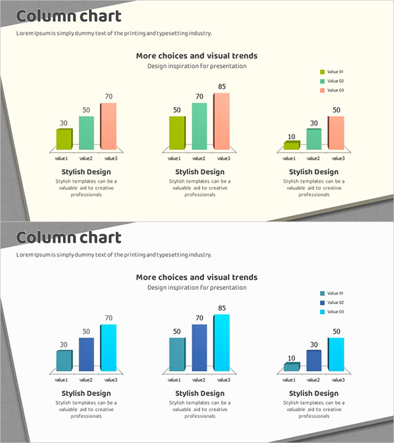
A PowerPoint slide set featuring grouped column charts with three data series for multi-dimensional performance analysis. The bars are color-coded in green, teal, and coral to distinguish quarterly sales results, departmental performance, or competitive benchmarking. Optimized for 16:9 widescreen format with 2 slides, each containing 3 independent chart areas for simultaneous multi-metric visualization. Clear numerical labels enable immediate presentation use, and all data can be directly edited in PowerPoint to match your actual figures. The grouped bar layout makes it easy to compare values across categories and series at a glance.
Usage Points
-
Main Usage
Designed to compare three or more data series simultaneously, such as quarterly sales figures, departmental KPIs, or competitor benchmarks. Numerical labels on each bar ensure precise data communication. Ideal for executive reports, investor presentations, market analysis decks, and performance dashboards.
-
How to Use
Each of the 2 slides contains 3 independent grouped column charts. Use PowerPoint's built-in chart editor to replace the legend labels (Value 01, 02, 03) and X-axis categories (value1, 2, 3) with your actual data. Adjust bar heights to reflect your values while maintaining the color scheme. Colors can be customized via the theme palette if needed.
-
Recommended For
Finance, sales, and marketing professionals presenting quarterly or annual results; executive leadership preparing board reports; investor relations teams; consulting firms conducting competitive analysis; educators teaching data visualization and statistical analysis.
-
Slide Structure
2-slide layout with 3 grouped column charts per slide. Each chart displays 3 data series (green, teal, coral bars), 3 X-axis categories (value1, 2, 3), and Y-axis scale (0–85). Legend positioned top-right. Descriptive text 'Stylish Design' appears below each chart. 16:9 aspect ratio with angled design elements on slide edges.
Related Products
-

Analysis of Bakery and Seafood Market Trends with Bar and Column Charts
#Market and Competitor Analysis #Financial Plans and Performance #Graph
-

Graph of Increase/Decrease in Meat Consumption – Market Analysis and Competitive Advantage
#Market and Competitor Analysis #Financial Plans and Performance #Graph
-

Analyze Sales Performance with Geometric Pattern Wide Bar Chart
#Market and Competitor Analysis #Financial Plans and Performance #Graph
-

Carbon Neutral Sales and Profit Chart – Sustainable Management
#Market and Competitor Analysis #Financial Plans and Performance #Graph
