Visualizing Simple Design Trend with Donut Chart PPT
RJ0200059_33
- Last Update 04/15/2025
- File Size 0.2MB
- # of Slides 2
- File Format PPTX
- Slide Ratio 16:9
- Color
Keywords
- #Content-Based Slides
- #Design-Based Slides
- #Company Introduction
- #Product/Service Introduction
- #Graph
- #Key Achievements
- #Development Status
- #Circles
- #Doughnut Chart
- #16:9
- #donut chart PowerPoint slide
- #pie chart visualization
- #4-segment data chart
- #proportional data template
- #graph PowerPoint slide design
About the Product
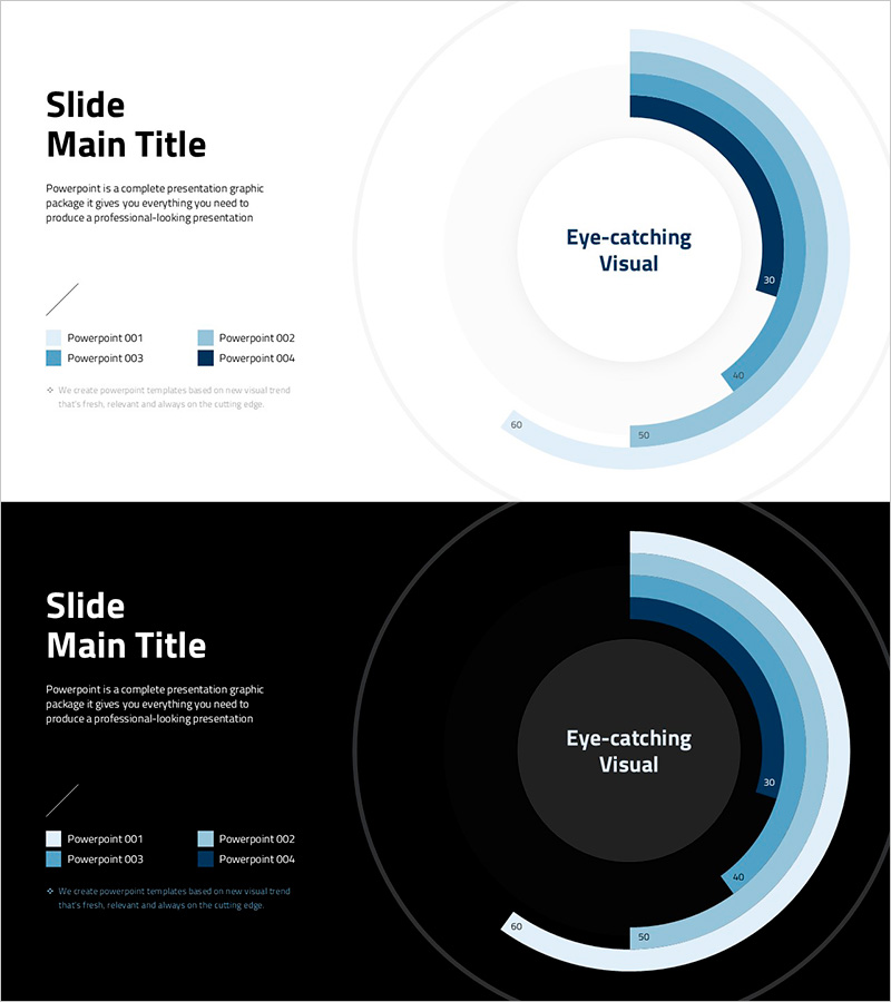
A PowerPoint slide featuring a 4-segment donut chart that visualizes proportional data with a blue gradient color scheme ranging from light blue to dark navy. The layout combines a title and description area on the left with a centered circular chart displaying numerical labels for each segment. This slide deck is ideal for business presentations, reports, and data-driven discussions covering sales performance, project progress, market share, or budget allocation. Two versions are included—one with a light gray background and one with a dark background—ensuring compatibility with various presentation environments. Fully editable in PPTX format for immediate customization.
Usage Points
-
Main Usage
Display proportional and compositional data using a donut chart that immediately communicates the relative size of four categories. The blue gradient color scheme differentiates each segment while numerical labels ensure precise data communication to your audience.
-
How to Use
Apply this slide to presentations covering sales performance analysis, project progress reports, market share comparisons, or budget allocation reviews. Edit the title and description on the left side, update the legend to reflect your data categories, and adjust the chart values as needed.
-
Recommended For
Executives, marketing teams, sales professionals, and project managers presenting at board meetings, strategy sessions, or client pitches. Particularly effective for finance, sales, and operations departments communicating quarterly results and performance metrics.
-
Slide Structure
Two-slide set with identical layouts in light and dark backgrounds. Each slide features a left-aligned text area (title, description, legend) and a right-aligned 4-segment donut chart. The chart uses four blue gradient shades (light blue, medium blue, dark blue, navy) with numerical values (30, 40, 50, 60) labeled on each segment.
Related Products
-

Ability Donut Chart for Performance Visualization – Emphasizing Key Achievements
#Company Introduction #Product/Service Introduction #Graph
-

Square Frame Template Pie Chart – Elegance in Data Visualization
#Company Introduction #Product/Service Introduction #Graph
-

Writing Instrument Icon Pie Chart – Company Introduction and Product Achievements
#Company Introduction #Product/Service Introduction #Graph
-

Doughnut Chart for Visualizing Key Achievements – Quality Presentation
#Company Introduction #Product/Service Introduction #Graph
