Donut Charts in 4 Fields – Effective Performance Visualization
RJ0500048_18
- Last Update 06/20/2025
- File Size 0.4MB
- # of Slides 2
- File Format PPTX
- Slide Ratio 16:9
- Color
Keywords
- #Content-Based Slides
- #Design-Based Slides
- #Company Introduction
- #Product/Service Introduction
- #Graph
- #Key Achievements
- #Development Status
- #Circles
- #Doughnut Chart
- #16:9
- #donut chart PowerPoint
- #pie chart slide template
- #4-segment chart presentation
- #performance comparison slides
- #data visualization PPT
About the Product
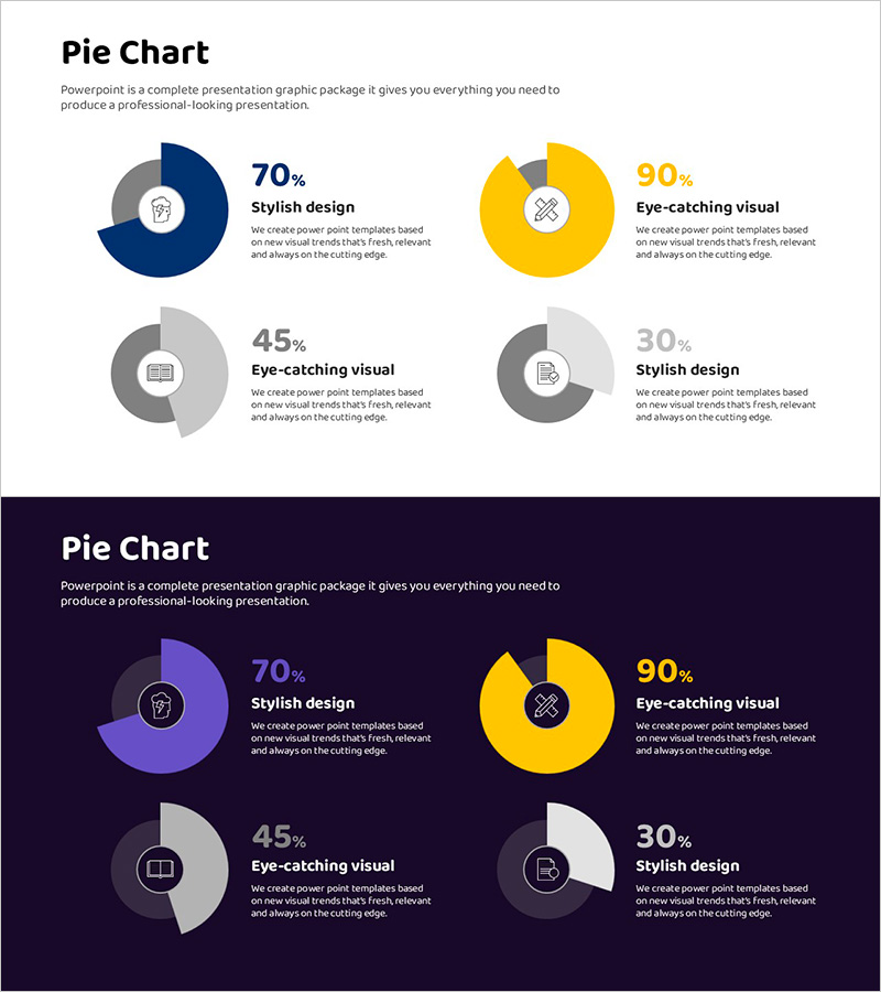
A PowerPoint slide set visualizing performance across four key areas using donut charts. Includes two design versions: dark background (navy and purple tones) and light background (white), each featuring four donut-shaped pie charts with centered icons and percentage values. The color-coded segments (gray, blue, yellow) clearly differentiate each metric, making data comparison intuitive and visually engaging. Ideal for KPI dashboards, success rate analysis, satisfaction metrics, and multi-category performance reviews in business presentations and reports. Fully editable PPTX format ready for immediate customization.
Usage Points
-
Main Usage
Simultaneously compare and visualize four critical performance indicators (design quality, visual impact, user experience, trend alignment) using donut-shaped pie charts. The centered icons and percentage labels emphasize each metric's significance, enabling stakeholders to quickly grasp multi-category performance at a glance.
-
How to Use
Deploy in executive dashboards, quarterly performance reports, marketing analysis decks, and KPI review presentations. Use the dark background version for large-scale projections and outdoor presentations; apply the light background version for printed materials and digital documents. Customize the icons and labels to match your specific metrics.
-
Recommended For
Executive briefings, quarterly business reviews, marketing campaign result analysis, customer satisfaction surveys, product quality assessments, team capability evaluations, and any presentation requiring simultaneous comparison of four quantitative metrics. Particularly effective for highlighting proportional data across multiple departments or product lines.
-
Slide Structure
Two-slide set: Slide 1 features light background with four donut charts in 2×2 grid layout (dark blue 70%, yellow 90%, gray 45%, gray 30%). Slide 2 displays identical chart structure on dark navy background with purple, yellow, and gray color variations. Each chart includes centered icon (lightbulb, bandage, notebook, document), percentage value, and descriptive label positioned to the right.
Related Products
-

Doughnut Chart for Visualizing Key Achievements – Quality Presentation
#Company Introduction #Product/Service Introduction #Graph
-

Visualizing Bicycle Performance with Donut Chart
#Company Introduction #Product/Service Introduction #Graph
-

Square Frame Template Pie Chart – Elegance in Data Visualization
#Company Introduction #Product/Service Introduction #Graph
-

Visualizing Simple Design Trend with Donut Chart PPT
#Company Introduction #Product/Service Introduction #Graph
