Balloon Donut Chart for Key Achievements Visualization – Successful Data Presentation
RJ0500023_4
- Last Update 06/13/2025
- File Size 0.5MB
- # of Slides 2
- File Format PPTX
- Slide Ratio 16:9
- Color
Keywords
- #Content-Based Slides
- #Design-Based Slides
- #Company Introduction
- #Product/Service Introduction
- #Graph
- #Key Achievements
- #Development Status
- #Circles
- #Doughnut Chart
- #16:9
- #donut chart PowerPoint
- #pie chart slide template
- #data visualization presentation
- #performance metrics PPT
- #4-item ratio chart
- #balloon callout diagram
- #percentage data slide
About the Product
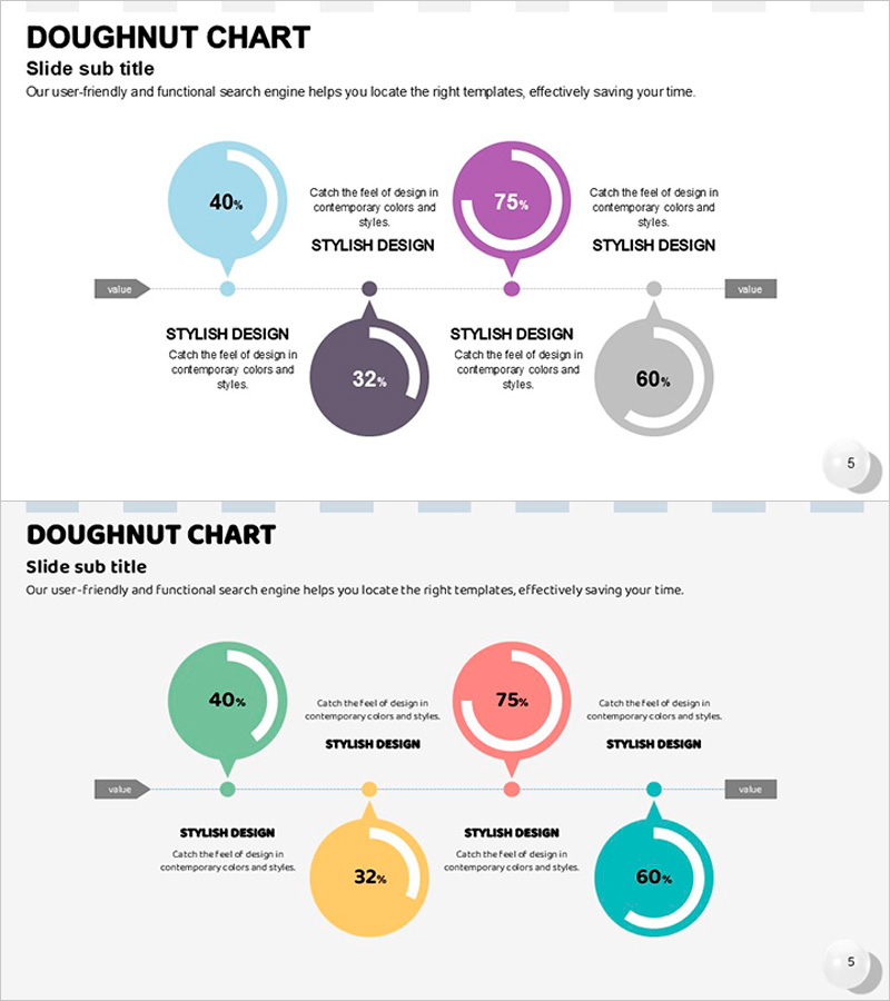
A professional donut chart PowerPoint slide designed to visualize key achievements and critical metrics with visual impact. Four donut charts in light blue, purple, dark gray, and light gray are paired with balloon callout elements, each displaying percentage-based data for intuitive audience comprehension. The 2-slide set features a centered top layout on the first slide and a vibrant multi-color variation on the second slide, maintaining presentation consistency. Ideal for product introductions, performance reports, market analysis, and quarterly reviews where numerical data requires clear visual communication.
Usage Points
-
Main Usage
Effectively communicate percentage-based performance indicators, market share, customer satisfaction scores, and product feature comparisons across four categories using circular donut charts. Balloon callout elements highlight each data point, ensuring key messages resonate with your audience.
-
How to Use
Insert this slide into product introduction sections to compare core feature strengths, or use in performance report segments to visualize quarterly results. Simply edit the percentage values within each donut chart to reflect your actual data and replace callout text with category names for immediate deployment.
-
Recommended For
Marketing professionals, sales teams, executives preparing board reports, product managers, and consultants who need to present data-driven insights. Particularly effective when categorizing quantitative information into four or fewer segments and requiring clear visual hierarchy.
-
Slide Structure
2-slide set. Slide 1: Four donut charts (light blue 40%, purple 75%, dark gray 32%, light gray 60%) arranged horizontally along a connecting line with balloon callout text areas beside each chart. Slide 2: Identical structure with mint green, coral pink, yellow, and cyan color palette for flexible presentation tone adaptation.
Related Products
-

Donut Charts in 4 Fields – Effective Performance Visualization
#Company Introduction #Product/Service Introduction #Graph
-

Visualizing Bicycle Performance with Donut Chart
#Company Introduction #Product/Service Introduction #Graph
-

Square Frame Template Pie Chart – Elegance in Data Visualization
#Company Introduction #Product/Service Introduction #Graph
-

Little Witch and Donut Chart – Visualizing Achievements in Presentation Slide
#Company Introduction #Product/Service Introduction #Graph
