Visual Trend Analysis through Data Visualization – The Power of Stunning Design
RJ0200052_6
- Last Update 04/13/2025
- File Size 0.5MB
- # of Slides 2
- File Format PPTX
- Slide Ratio 16:9
- Color
Keywords
About the Product
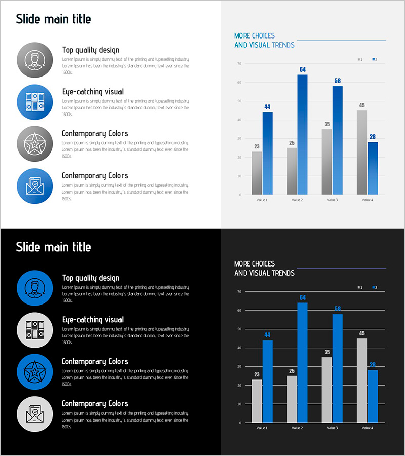
A 2-slide PowerPoint template featuring grouped bar charts for multi-series data visualization. Each slide displays 4 data series side-by-side across 4 categories, enabling clear comparative analysis. The left panel includes icon-based callout boxes for key messages, while the right side showcases the grouped bar chart with labeled values. Two design versions are provided: light background and dark background, allowing flexibility in presentation styling. Fully editable in 16:9 aspect ratio, PPTX format compatible with all PowerPoint versions.
Usage Points
-
Main Usage
Ideal for presenting comparative data across multiple categories and series simultaneously. Commonly used for sales performance, customer satisfaction metrics, market share analysis, and KPI tracking. The icon-based callout section on the left reinforces the data narrative and highlights key insights.
-
How to Use
Replace the bar heights and numeric labels with your actual data values. Each of the 4 series is color-coded for easy distinction; ensure your legend clearly identifies each series. Customize the left-side icons to match your data theme (sales, customers, performance, etc.) and add relevant analysis text in the callout boxes.
-
Recommended For
Executive reports, quarterly performance reviews, marketing analytics presentations, financial summaries, and organizational KPI dashboards. Suitable for sales teams, marketing departments, business analysts, finance professionals, and management consultants.
-
Slide Structure
Slide 1 (light background): Left panel with 4 circular icons and text callouts; right panel with grouped bar chart (4 categories × 4 series, labeled values). Slide 2 (dark background): identical layout with dark theme applied. 16:9 aspect ratio, PPTX format.
Related Products
-

KPI Target vs Actual Slide – 4-Metric Dark Red & Purple
#Company Introduction #Business Strategy #Financial Plans and Performance
-

Year-over-year Performance Comparison Chart – Key to Business Analysis
#Company Introduction #Market and Competitor Analysis #Diagram
-

Key Performance Analysis Graph – Visualizing Business Growth
#Company Introduction #Market and Competitor Analysis #Graph
-

Future Technology Business Analysis Chart – Performance Focus
#Company Introduction #Market and Competitor Analysis #Graph
