KPI Target vs Actual Slide – 4-Metric Dark Red & Purple
RBTK0200001_6
- Last Update 05/06/2026
- File Size 12.3MB
- # of Slides 2
- File Format PPTX
- Slide Ratio 16:9
- Color
Keywords
- #Design-Based Slides
- #Company Introduction
- #Business Strategy
- #Financial Plans and Performance
- #Graph
- #Key Achievements
- #Achievements
- #Sales and Revenue
- #Table
- #Column
- #Standard Table
- #Grouped Column
- #16:9
- #KPI target vs actual performance PowerPoint slide
- #business performance review presentation template
- #KPI achievement rate slide deck dark theme
- #board presentation KPI comparison PowerPoint
- #four-metric target actual presentation slide
About the Product
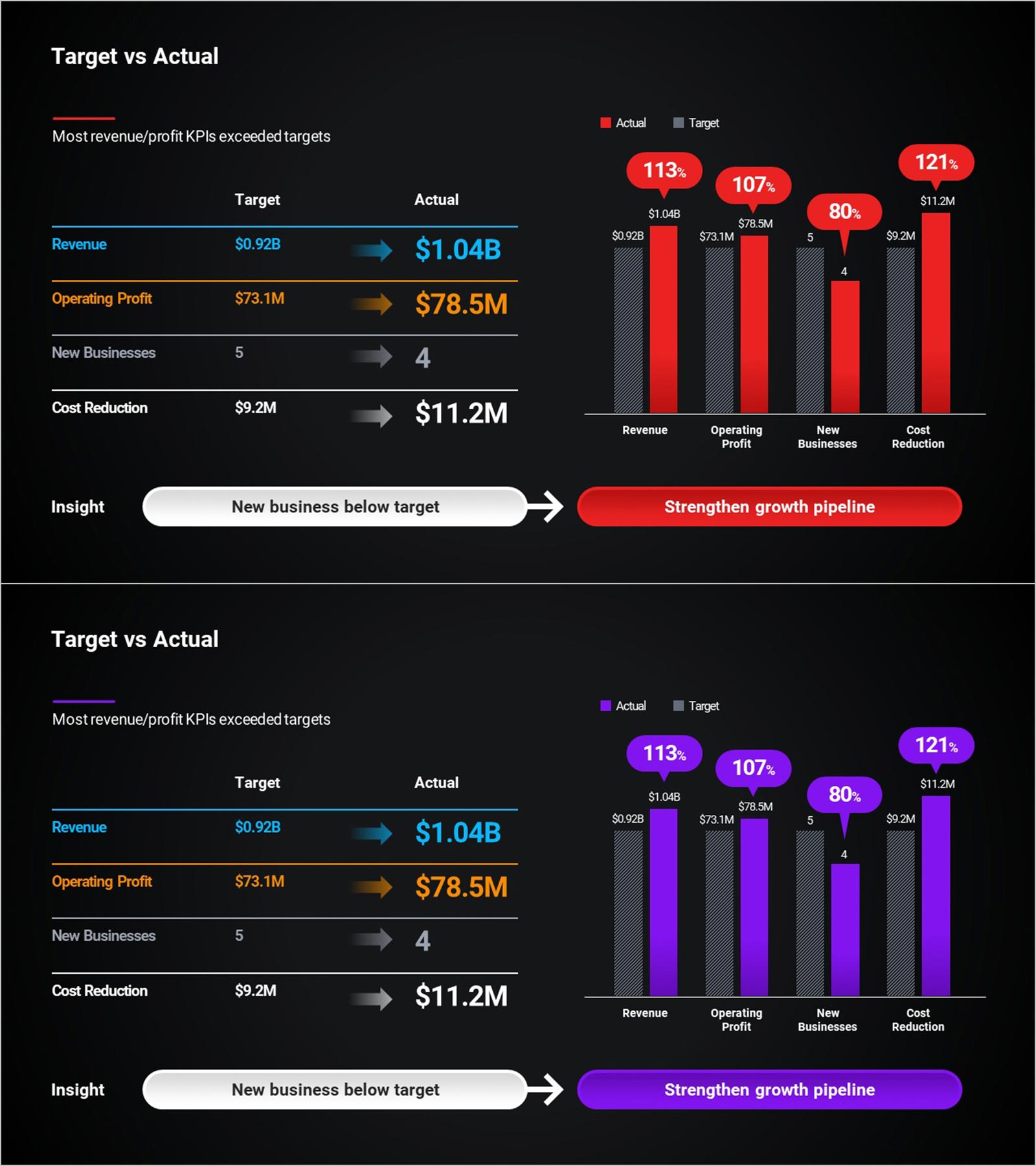
KPI target versus actual performance PowerPoint slide with a four-row comparison table, grouped bar chart, and insight banner. The left table presents four KPIs with target and actual arrows: Revenue ($0.92B target → $1.04B actual, 113%), Operating Profit ($73.1M → $78.5M, 107%), New Businesses (5 → 4, 80%), and Cost Reduction ($9.2M → $11.2M, 121%). The right grouped bar chart shows target (gray hatched) versus actual (red or purple) bars with achievement-rate speech bubbles above each. A bottom insight banner highlights "New business below target" with a directional arrow to "Strengthen growth pipeline." Dark background in red-accent and purple-accent variants. Editable in PowerPoint for corporate performance reviews, board presentations, and IR pitch decks.
Usage Points
-
Main Usage
Use as the KPI performance section in corporate board presentations and IR pitch decks. Presents four metric achievement rates and a missed target insight in one PowerPoint slide.
-
How to Use
Replace KPI names, target values, and actual values in the table and chart with your data. Update the insight banner text and CTA with your action items in PowerPoint.
-
Recommended For
Ideal for corporate planning teams, IR managers, and executives presenting KPI achievement rates and business performance gaps to investors, board members, and management.
-
Slide Structure
One slide. Title and subheadline. Left: KPI comparison table with arrows. Right: grouped bar chart with bubbles. Bottom: insight and CTA banner. Dark red and purple versions.
Related Products
-

Orange Green Profit and Loss Chart – Visualizing Revenue and Profit
#Financial Plans and Performance #Diagram #Graph
-

Sales and Profit Table – Visualizing Financial Performance
#Market and Competitor Analysis #Financial Plans and Performance #Diagram
-

Sales & Performance Status Slide – Data-Driven Insights
#Company Introduction #Market and Competitor Analysis #Diagram
-

Camera and Vertical Stacked Charts Slide
#Business Strategy #Financial Plans and Performance #Graph
