Sales & Performance Status Slide – Data-Driven Insights
RM0300015_17
- Last Update 09/11/2025
- File Size 0.3MB
- # of Slides 2
- File Format PPTX
- Slide Ratio 16:9
- Color
Keywords
- #Content-Based Slides
- #Design-Based Slides
- #Company Introduction
- #Market and Competitor Analysis
- #Diagram
- #Graph
- #Key Achievements
- #Market Analysis
- #Table
- #Column
- #Standard Table
- #Grouped Column
- #16:9
- #grouped bar chart PowerPoint
- #sales performance slide
- #data visualization presentation
- #business report graph
- #how to create grouped bar chart in PowerPoint
About the Product
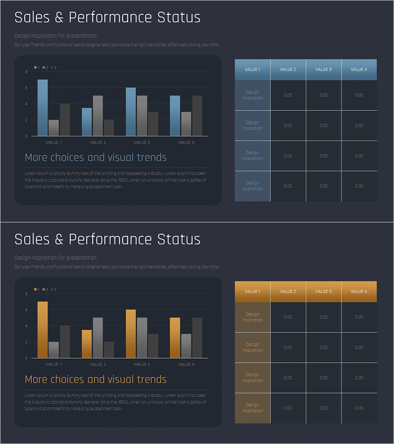
A 2-slide PowerPoint presentation that visualizes sales and performance status with clarity and impact. Each slide features a grouped bar chart comparing 4 items across 4 data series, paired with a corresponding data table for precise numerical reference. Two color schemes are provided: blue and orange versions, allowing flexible design choices for different presentation contexts. All text, values, and chart data are fully editable, enabling quick customization for your specific metrics and reporting needs.
Usage Points
-
Main Usage
Present quarterly, monthly, or departmental sales figures and performance metrics to stakeholders with visual clarity. The dual representation of bar chart and data table ensures both visual impact and numerical accuracy, making complex performance data easy to understand at a glance.
-
How to Use
Ideal for executive reports, quarterly earnings presentations, departmental performance reviews, investor briefings, and board meetings. Simply replace the sample data with your actual figures and adjust the chart values to reflect your metrics. The table automatically syncs with the chart for consistency.
-
Recommended For
Finance teams, sales managers, executives, business analysts, consultants, and data-driven professionals who need to communicate performance metrics. Perfect for quarterly reviews, annual reports, marketing campaign ROI analysis, and competitive benchmarking presentations.
-
Slide Structure
Slide 1: Blue-themed grouped bar chart (4 items × 4 series) with right-aligned data table (4 rows × 4 columns), title, subtitle, legend, and axis labels. Slide 2: Identical layout with orange color scheme. Both slides support easy data editing and chart updates.
Related Products
-

Touch Wide Slide Template – Column Chart & Table
#Market and Competitor Analysis #Diagram #Graph
-

Sales and Profit Table – Visualizing Financial Performance
#Market and Competitor Analysis #Financial Plans and Performance #Diagram
-

Table Chart & Clustered Column Graph – Market and Competitor Analysis
#Market and Competitor Analysis #Diagram #Graph
-

Graph Analysis of Growth – Data Visualization for Competitive Advantage
#Market and Competitor Analysis #Diagram #Graph
