Year-by-Year Comparison Analysis Bundle Graph – Visualizing Market Performance
RM0300020_17
- Last Update 02/12/2025
- File Size 0.3MB
- # of Slides 2
- File Format PPTX
- Slide Ratio 16:9
- Color
Keywords
- #Content-Based Slides
- #Design-Based Slides
- #Company Introduction
- #Market and Competitor Analysis
- #Diagram
- #Graph
- #Key Achievements
- #Market Analysis
- #Table
- #Column
- #Grouped Column
- #16:9
- #clustered bar chart PowerPoint
- #year-over-year comparison slide
- #multi-series data visualization
- #market performance chart
- #how to create clustered bar chart in PowerPoint
About the Product
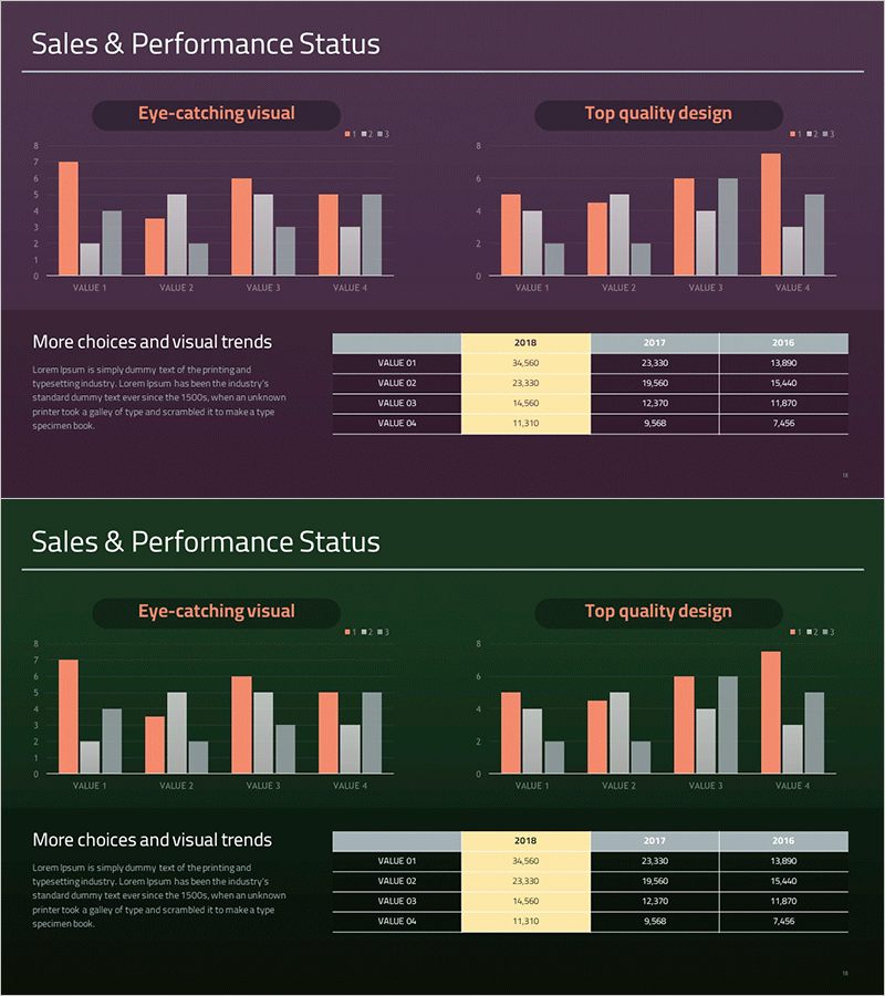
A 2-slide PowerPoint presentation featuring clustered bar charts that visualize year-over-year market performance across four data series. The design uses contrasting orange and gray tones to distinguish data categories clearly, with the left chart labeled 'Eye-catching visual' and the right chart labeled 'Top quality design.' The bottom data table displays numerical values for four VALUE items from 2018 to 2016, ready for immediate use in business presentations and performance reports. Formatted in PPTX with 16:9 widescreen ratio for universal compatibility across all presentation environments.
Usage Points
-
Main Usage
Designed to compare multiple data series across different time periods and communicate market performance trends with clarity. The clustered structure allows viewers to instantly grasp numerical differences between categories, making it ideal for executive reports, business analysis, and marketing performance presentations.
-
How to Use
Input your actual data into the left chart and the right chart automatically synchronizes. Edit the VALUE 01–04 items and year labels in the bottom data table to transform the slide with your business metrics. Colors and fonts can be adjusted to match your corporate branding guidelines.
-
Recommended For
Financial analysts, marketing managers, business planning teams, and executives presenting quarterly or annual performance reviews. Particularly effective when comparing four or more metrics simultaneously, such as revenue, customer count, market share, and brand awareness across multiple years.
-
Slide Structure
Two-slide layout featuring dual clustered bar charts (left and right) using orange, gray, beige, and black color series. The bottom section contains a data table with year columns (2018, 2017, 2016) and four VALUE rows. All elements are balanced within a 16:9 widescreen format for professional presentation delivery.
Related Products
-

Year-over-year Performance Comparison Chart – Key to Business Analysis
#Company Introduction #Market and Competitor Analysis #Diagram
-

Sales & Performance Status Slide – Data-Driven Insights
#Company Introduction #Market and Competitor Analysis #Diagram
-

Graph Analysis of Growth – Data Visualization for Competitive Advantage
#Market and Competitor Analysis #Diagram #Graph
-

Graph of Financial Outlook Analysis after Investment Attraction
#Business Introduction #Market and Competitor Analysis #Diagram
